Thursday
Feb252016

waterproofs

a riding mac

God people are clever.  Mackintoshes, waterproof raincoats, done originally in 1824 by dissolving rubber in naphtha to liquidise it and putting it between two layers of fabric, done evidently by the Aztecs (not the naphtha, they just used latex).  It’s all very chemical, the processing of rubber so it doesn’t smell, or melt or harden.  When you think that before this one relied on the natural oils in thick wool to repel water, and I suppose leather capes, the mackintosh must have felt featherweight in comparison.  

I had a short cream riding mac once, like the one above with the leg straps and everything, foolishly gave it away and now find they are £420.  I should have cleaned mine with a raw potato and soaked the red ballpoint mark on the sleeve out with milk.

Got a waxed jacket for living in Duncan’s Cove, south of Halifax, where waves bash the rocks and are quite drenching.  Originally it was sails that were waxed, to make them more efficient against wind; fish oils, then linseed oil on lighter canvas reduced the weight of the sails in the overall tonnage of the ship, allowing it to go faster.  We are speaking of the mid-nineteenth century here.  Linseed oil turns yellow: fishermen’s slickers are yellow by tradition, but originally by linseed oil.  In the 1920s cotton started to be impregnated with petroleum-based materials: paraffin mainly, then cupro-ammonia – the solution used to produce Bemberg and cupro rayon.  Not until the 2000s was cupro-ammonia replaced by a hydrocarbon wax, which is what Barbour gives you a little can of when you buy a jacket.  It looks like vaseline and when you use it to touch up the wear where the waxing has worn off gives you a horrible greasy jacket you can’t hang up next to anything else.  The dark olive green of the Barbour comes from the copper in the cupro-ammonia.

It is very warm, this waxed jacket, and has that hunting and fishing look that flags a certain segment of the British class system and its wannabes. But it is very warm and quite useful in a Calgary winter.  I like things that you never have to buy again because they never, ever wear out and have zero relation to the fashion industry.  Well that’s not quite true, they float in and out of desirability.

a Barbour, well worn and resembling something primeval, lichenous, beaten about by life in the elements. Gore-Tex: now that is made of Teflon.

Tuesday
Feb232016

fixing things

How to clean a Mackintosh. Gallaher's cigarette card No 35 of the How to do it series. It is surprising how much a cut raw potato can do, from cleaning oil paintings to your muddy mac.  These ‘how to do it’ cards are wildly inventive, a combination of old remedies such as taking salt stains from brown (?) shoes with washing soda dissolved in milk – milk is very useful for a lot of problems evidently; it dissolves ink even – to mending broken china with molten alum, whatever that is.  I expect this set of cards is the collected wisdom of the butler, the maid of all work and the housekeeper — it is all about fixing things with much ingenuity and common materials.
 
I used to take all this to heart, this kind of mending and fixing, renewing and caring.  Always there were the stories of elderly blind ladies who could mend smashed teacups by feel.  It was very hard.  Everything I have is mended, badly.  Many things that seem so simple in the drawings and the 80-90 words of masterfully concise text are terribly difficult to actually do well.  Maybe if you’d done something a hundred times, and knew what it all felt like, it would work.  I’m not sure we know how to do anything much, with our hands, any more.  

How to clean a clock is a classic: put some cotton batten soaked in coal oil in the innards: the fumes will loosen any dust and it will fall off the mechanism.  Really?  How was this discovered?  Thomas Barrow looks after all the clocks at Downton – I suppose he knows about this.

Friday
Feb052016

Heroes: Aphex Twin remix

Can't write anything these days; music so much more eloquent.

Monday
Dec282015

Bow and Arrow

the other side of my Alberta:

Thursday
Dec172015

Tanya Tagaq: Nanook of the North, 2012

Amid all the flurry of Tanya Tagaq's soundtrack to a re-issue of Robert Flaherty's 1923 silent film, Nanook of the North, here is an earlier video where she explains throat singing.  She appears to be in the British Museum, an interesting post-colonial meeting of ancient cultures, hers a bit older than the one in the background.

And here is a short excerpt of her performance at TIFF First Peoples 2012, accompanying the screening of Nanook of the North.

Flaherty's view of the north, based on laughing children and naive hunters bringing pelts in to a Hudson's Bay post, was famous and deeply patronising. 

Tagaq's soundtrack (composed by Derek Charke, with Tagaq and musicians Jesse Zubot and Jean Martin), the power of the voice, the chords, the sound of the wind and the animals, goes a long way to undercut the paternalism of Flaherty's gaze.  Tagaq's is a complex post-colonial project: to walk forward to encounter the colonial past and, while protecting, even feeding, the subjects of the film, to reveal the ethnographic expoitation of the filmmaker.  It is complex because although the Inuit in the film are real, this first film that showed how they lived was completely constructed by Flaherty. 

I saw Nanook of the North a long time ago, in the ealy 90s, and had to watch it in two minds: one saw the people, the other saw the ways that 'the people' were being made palatable to the film-going public through a sentimental narrative that goes, still, to the heart of attempts at reconciliation culminating in the Truth and Reconciliation Commission report released this week.  The more we see the truly tragic little people sitting at their desks in their Residential Schools, being so good, and so sad, the more they seem to obliterate the images of their descendents who are still struggling: not as photogenic, more present as some work at keeping one's alleys free of bottles, others get their PhDs.  The great awakening of the Canadian public to Residential Schools (why they needed awakening is a mystery as almost every community in Canada knew precisely where the school was) has, I fear, awakened a sentimentality that does not lead anyone out of the woods. 

Here, in all its endless insult is Flaherty's Nanook of the North:


Thursday
Nov052015

Peter Lanyon: Thermal, 1960; John Gillespie Magee: High Flight, 1941

Peter Lanyon, 1918-1964. Thermal, 1960. Oil on canvas, 1829 x 1524mm. Tate T00375, purchased 1960.

If there was ever a painting that matched John Gillespie Magee's High Flight, below, it is Lanyon's Thermal, above.

Oh! I have slipped the surly bonds of Earth
And danced the skies on laughter-silvered wings;
Sunward I’ve climbed, and joined the tumbling mirth
of sun-split clouds, — and done a hundred things
You have not dreamed of — wheeled and soared and swung
High in the sunlit silence. Hov’ring there,
I’ve chased the shouting wind along, and flung
My eager craft through footless halls of air....

Magee was in the RCAF, Lanyon RAF; Magee killed at 19 in 1941, Lanyon survived to buy a glider and paint what he saw into the early 1960s.  There is a resurgence of interest in Lanyon because of a new exhibition at the Courtauld.  Well-known, but not well-featured, but now there are articles on him everywhere, Thermal explained, Silent Coast discussed: the point where abstract expressionism met English landscape.  
However it is explained, what I see in Thermal is that 1960s Austin side mirror shape that gives the whole painting its scale from the era to the plane, to the air outside it.  

Silent Coast, below, just from the name alone, tells us it is an aerial of a coastline, beautiful but less magical than Thermal, which is complex, difficult. 

Peter Lanyon, Silent Coast, 1957. oil on masonite, 122 x 93.6 cm, Manchester City Galleries

Perhaps surviving WWII (Lanyon was stationed in the North Africa theatre, dangerous, but not as lethal as John Gillespie Magee's Sqd 412, an RCAF bombing squadron flying over Europe where an aircrew's life expectancy was about two weeks) – perhaps surviving WWII made Lanyon particularly free.  For those who did survive, the war had been the high point of their lives and they'd made it through.  The last verse of Magee's High Flight actually does not seem to end, so sublime is the moment of flight.  Like Thermal, it is entirely absorbed in the act of flying, where survival, or not, is in the future and hardly to be thought of.

Up, up the long, delirious, burning blue
I’ve topped the wind-swept heights with easy grace.
Where never lark, or even eagle flew —
And, while with silent, lifting mind I've trod
The high untrespassed sanctity of space,
- Put out my hand, and touched the face of God.

Thursday
Oct222015

Gordon Matta-Clark: Splitting, 1974


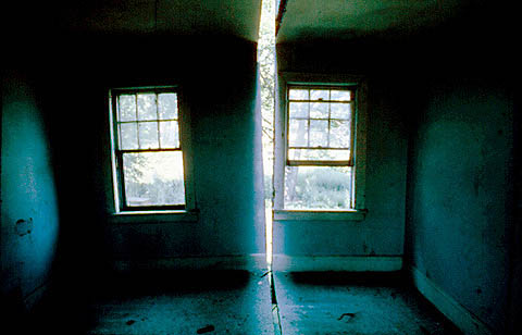
Gordon Matta-Clark Splitting (detail) 1974 322 Humphrey Street, Englewood, New Jersey courtesy of David Zwirner, NY and the Estate of Gordon Matta-Clark

Gordon Matta-Clark had such a brief career, but what he did was so influential.  For Splitting, 1974, he took an abandoned house and cut a channel through it as if with a cheese cutter.  The house didn't fall down although the attack on its structural integrity would have been drastic if it hadn't then been subsequently demolished.  Splitting actually refers to the set of photographs Matta-Clark made of the rooms slashed by light from the narrowly sliced outside wall.  

One doesn't cut through a woodframe house as if it was a piece of cheese.  It took a chain saw to cut each roof shingle, sheathing board, beam, joist, floorboard, lathe, plaster wall, plumbing pipe, window frame, chimney breast, stair tread and riser.  The thought is conceptual, the act is laborious.  

His beautiful film:

Splitting By Gordon Matta-Clark from GM Clark on Vimeo.

Matta-Clark's work is generally seen as 'a critique of bourgeois American culture' which makes little sense to me now.  It seems what he was doing was classic modernist sculptural technique, in the way David Smith assembled and welded steel sheets and then sometimes cut the piece in half and rearranged it.  My source for this is an ancient film I once saw on his working methods where he was working with steel the way the rest of us were working with cardboard.  The difference between working with mild steel and walls of a building is perhaps financial: abandoned houses and warehouses were available the way wrecked cars were for John Chamberlain.  But because both these materials fall into the category of detritus, or found materials, or salvage, their history leads to a set of particular and peculiar narrative arcs for the sculpture made from them.  


Peter Eisenman, House VI, Cornwall, Connecticut, 1975. photograph NJITPeter Eisenman's House VI of 1975, just one year after Splitting, famously had a glazed slit in the bedroom from ceiling to wall to floor.  At the time it was discussed as an illustration of the wilfulness of the architect, forcing his clients to sleep in twin beds to preserve the slipping planes of the design process that at one (arbitrary) point stopped, was built and occupied.  Although Eisenman's slice out of three planes of the room appropriates Matta-Clark's slice out of a house in New Jersey, it comes from completely different reasoning.  

Here is a video by Steve Trefois and Laurent Arnoldi on House VI, if one has the patience.

Peter Eisenman - House VI Steve Trefois - Laurent Arnoldi from AlICe lab on Vimeo.


Monday
Oct122015

John Chamberlain: HAWKFLIESAGAIN, 2010

John Chamberlain, HAWKFLIESAGAIN, 2010. Painted and chrome-plated steel, 270 x 311 x 221 cm. Artwork Copyright John Chamberlain. Courtesy of the artist and Gagosian Gallery, photo by Mike Bruce

I'm wondering if there isn't an over-reliance on narrative in much of sculpture today.  Hirschhorn's 2015 In-Between spells out a narrative of building collapse: what it might look like, were it to happen.  As such it doesn't really look like buildings in collapse, which fall apart along structural lines unless helped by a lot of semtex.  However, it is the narrative that is important.  Jeremy Deller's 2009 It Is What It Is, has a more journalistic narrative: the bombed car is a bombed car, importantly from a specific time and place.

As a correlative, I find myself thinking of John Chamberlain's crushed car sculptures of the 1960s which, in his own words, had no weighty narratives attached, he only said they were about detritus, as that is what they were made from: 'individual pieces that are divorced from their material past' which have certain aesthetic qualities – colour, shape, shine, rust, but little 'historical indexical meaning' (these notes from a review by Anne Blood on Chamberlain's 2011 show at the Gagosian, London, the same year that he died).

However, over my adult life, these sculptures have had a zillion narratives and meanings projected on to them; even Anne Blood sees them as 'works formed like a piece of jazz improvisation, the separate pieces meeting like notes in the air, striking harmonics and chords – atonal or harmonious – but ultimately coming together into a pleasing whole' – a projected narrative of working methods, which may or may not be true.  For decades Chamberlain's sculptures were said to 'represent' the excesses of American throwaway culture, its love of big cars, speed, freeways and accidents.  They were, at one time, included in the Pop Art canon, because they used the products of American consumer culture.  They have occupied a subsection of American Arte Povera, because they investigate found materials and re-present them in a way that makes the commonplace a thing of marvel.  The archive of his works at Marfa's Chinati Foundation almost automatically enters the sculptures as land art: assemblages of stuff picked up in the landscape of dead cadillacs. But even at Marfa Chamberlain's works share space with Dan Flavin's neon tubes and Donald Judd's chrome-plated steel boxes, all industrial processes together, in various stages of assembly and decay.

After all these decades (four) can it be that a sculpture is simply the end product of its means of production (from which it derives its deep description) and not a production projecting a meaning, a lesson, a story, a parable?

Thursday
Oct082015

Thomas Hirschhorn: In-Between, 2015

Thomas Hirschhorn. In-Between. Photograph: Mark Blower

Thomas Hirschhorn's In-Between at South London Gallery has been reviewed in The Guardian under the title: 'Things fall apart: the beautiful Marxist bomb that's hit south London;  Artist Thomas Hirschhorn plays on our manic pleasure at seeing ruins by making a whole building collapse in on itself'   

But not really, it is in a gallery, which is still standing.  This is a simulacrum of a building collapsing in on itself.  Whatever he is doing, and it is explained in Adrian Searle's review, one has to ask whether or not such an installation does give us manic pleasure.  I'm not sure.  Hirschhorn quotes Gramsci's note, from Prison Notebooks, 'destruction is difficult; indeed, it is as difficult as creation'.  Well, whatever.  What is strange is that this art installation must be taken seriously in the light of the fairly simple destruction taking place in Palmyra, and the very similar images seen every day from Aleppo and Damascus.  Or even the destruction of the MSF hospital in Kunduz, which although it took half an hour, was relatively quick and one might say simple.  

Hirschhorn's ruins are actually made of cardboard and styrofoam standing in for concrete and steel, so technically, I suppose, a maquette, or a model.  He says, 'a ruin stands for a structural, an economical, a cultural, a political or a human failure' and it is failure he is giving form to.  Art is used here as an intermediary between real ruins and the causes of the real ruins, as if the lessons need to be spelled out.  Indeed Adrian Searle appreciates this.  If this exhibition is popular, does this indicate some sort of disaster fatigue amongst the general gallery-going first world public?  'oh god, another front page photo of a bombed building with little kids playing in the rubble. Can't take it in. Let's go look at Hirschhorn's ruin instead.'  

Compared to Jeremy Deller's It Is What It Is, his exhibition of the bombed car that killed 38 people in Iraq in 2007, In-Between is a limp thing, lacking in commitment and urgency,  It remains a maquette, and as such doesn't ask for much from the viewer.  Of course it is unfair writing about any work one hasn't seen, but I hadn't seen Deller's piece either, but I got it, or at least got what I needed to hear out of it.  And that is the point.  What, and how much, in any piece of art, passes a critical point whereby viewers find something to engage with, not just gaze at. In-Between seems a gesture, only. 

Thursday
Oct012015

Battle of Jutland

Three drawings of The Battle Cruiser Action in the Battle of Jutland during WWI. Taken from History of the Great War - Naval Operations, volume 3, Spring 1915 to June 1916 (Part 2 of 2) by Sir Julian S Corbett. London: Longmans, Green, 1921.

From History of the Great War - Naval Operations.  God this is exciting reading.  The first drawing above shows the movement of all the battle cruisers in this engagement from 2:45 to 3:00 pm. The next from 3:15 to 3:30, and the thrid from 3:40 to 4pm.  The speed is evident.  How quickly things moved.

Trafalgar was set up along Army lines: two opposing forces arrayed facing each other except that Nelson changed his line to two perpendicular arrows.  By the Battle of Jutland in the North Sea, May 31, 1916, opposing forces appear to operate parallel to each other, in feints and parries.  These were battle cruisers, weather not an issue but speed, torpedoes and range were.  It looks like a deadly dance chart.

Tuesday
Sep292015

The Battle of Trafalgar drawn after the fact

A lightly edited (by me) description from the website this print was found on: This is a popular print from about 1812. HMS Victory, followed by HMS Temeraire, is at the head of the left-hand column of British ships, which had been sailing for some considerable time into the teeth of the French and Spanish broadsides without being able to fire back. In the French line, just to the right of where HMS Victory's column is aiming, is the French flagship Bucentaure, and behind it the Redoutable. HMS Victory cut in between them and delivered a broadside into the stern and down the length of Bucentaure. Minutes later, a shot from high up on Redoubtable struck Lord Nelson with a fatal wound.

Nelson's enigmatic little sketch formalised into a historic account: mathematical, geometric, correctly military; theory rather than practice.  This is, perhaps, the danger in all writing after the fact. The narrative is clarified, made correct.  It is a design exercise, making a coherent object out of a melée on the sea with cannonballs breaking ships into splinters, people being killed, drowned, wounded.  In this allegedly 'popular' print, the sea is like the table tops of battles between lead soldiers.  By this time, seven years after Trafalgar, the battle had become mythic, as had Nelson.

Sunday
Sep272015

Nelson's battle plan for Trafalgar, 21 October 1805

Captain Horatio Nelson. Battle plan for the engagement with the combined fleets of the French and Spanish Navies, during the War of the Third Coalition of the Napoleonic Wars off Cape Trafalgar, Spain. 1805 © National Maritime Museum, London.

A wall of ships, the British ships sail toward it planning to cut the line in three, taking out the flagship first, i.e. no signals.  Not being a naval historian, and reading a brief summary, it appears that part of the English fleet was at Gibralter, weakening the total Navy, and so the French and Spanish thought they could defend Cadiz by forming a long line in front of it.  However, weather will intervene.  Little wind and contradictory orders to the French and Spanish to turn resulted in an extremely slow reformation leaving clumps of ships over a loose five-mile line.  In come two tight arrow-like British lines.  As they all were no doubt luffing around in the same calm weather, the battle must have seemed a bit like slow-motion.  However, outnumbered, outgunned and out-shipped, the British won, Nelson was shot and died, and storms that blew up the next day sank several of the wounded ships of the day before.  

If there is anything that endears one to Nelson's 'England expects that every man will do his duty' spelled out in signal flags flying from his own flagship, it is this scrap of a battle plan on the back of what looks like a bit of blotting paper.  One must never be seen to be trying too hard, but duty is done nonetheless.

Does this kind of thinking exist any more?  I only come across it in British espionage novels, those thrilling, complicated, but allegedly deeply conservative tales that pass these days as my escape reading.  Ex-SAS men gone rogue sort of stuff.  Not really rogue, in the end one finds they are on the side of right and duty.  Of course.

Anyway, beautiful little drawing.  It moves me to tears for some reason.

Wednesday
Sep162015

Bahamas: Please Forgive My Heart, 2013

This particular video is of the recording studio units that were used for Bahamas's Please Forgive My Heart, evidently a rare 1967 Germanium Neve console, which means nothing to me, but they also show a tiled shower stall for reverb.  I know about this because Eon Sinclair wrote an article in On Site review 28:sound 'Singing in the Rain', p43, about all the music recorded in washrooms in the 50s and 60s. Please Forgive My Heart is a Bobby Womack song, but that is by the way, other than his version of 2012 sounds pretty electronic – I don't think a shower played a part.

There were a lot of sound links in Eon's article which aren't linked in the ISSUU pdf, but are found here: www.onsitereview.ca/28/p43  We had to take off a few for copyright violation, but what's left is a half dozen videos with beautiful reverb.

It is always encouraging to find a substrata of creative activity that actually prefers the old techniques: vinyl lovers is one – a richer sound supposedly.  As I never get rid of anything, I still have my old vinyl collection, but without a system anymore to play it on, other that the Philips portable turntable I got for my birthday in grade 11, but which turns slightly faster than it should having had the belt replaced by Philips in London to suit the change in power delivery.  A long sentence, but one could do such things once. 

Tuesday
Sep012015

the freestep

Freestep bicycle

Having ridden a bike from the age of six, I've had in total four beloved bicycles in my whole life ending up with a quivering azure racehorse of a 10-speed that simply has a fit at each pebble in the road. I love it dearly. In this column I have written about bamboo bikes, ash bikes, carbon fibre frames, build-your-own bikes – it is a huge field: bicycles, bicycle lanes in cities, street bikes, bike-shares, bike couriers, bike paths, and the variety of bikes themselves is seemingly endless.  A long way from having to choose either a CCM or a Raleigh.  

This one, the Freestep, comes they say from the skateboard world. Well, only in the shape of the non-pedals really. Instead of pedalling, one pumps the boards as on a step-master thing (clearly out of my depth here).  No seat, you will notice. You stand and pump your way along, and in the process get very very fit.  

This model, above, has a nice fat retro frame, all gentle curves and cream enamel.  It is a curious blend of soft 1950s styling and 2010s auto-mobility here – we seem to want autonomous travel, without rules, just to be able to get about under our own steam seemingly without tradition, except for a sweet nostalgia that companies such as Best Made, or Labour and Wait promote.  It is a feeling that things were better once, that you could trust things when they were more solid, more straightforward, more utilitarian. Does this feeling exist in direct inverse proportion to how much time our minds spend in the virtual, ephemeral, complex world of our devices, while our bodies sit inert, in thrall to a preoccupied brain?  And somewhere after a long day at the screen face, we would like to take our clunky childhood bike and tool around the neighbourhood?


Tuesday
Aug042015

motels

Vincent Lamouroux. Projection: time and site-specific intervention on the Bates Motel, Los Angeles, 2015

No doubt everyone has seen this, the whitewashing of the old Sunset Pacific Motel slated for demolition on Sunset Boulevard in Los Angeles.  Vincent Lamouroux is the artist, there are several videos out there about the process (big machines spraying the trees, the ground and the building itself); it was open as an installation from 26 April to 10 May, 2015 and then left to the weather, again.  

Much has been made of the informal reference to the motel as the Bates Motel and Hitchcock's Psycho, despite the motel in the film being one of those old auto courts beside a lonely stretch of highway, and not in a city at all.  But whatever, a motel is a motel, evidently.  Does any derelict and empty building become sinister because it no longer functions in society?  And are motels particularly susceptible to this? Motels in film always offer anonymity for antisocial plot and action, it is a building type that exists outside the narrative of law and order, family homes and settled, normative lives. 

The Lorraine Motel, Memphis, TennesseeMartin Luther King was shot at the Lorraine Motel, now part of a Civil Rights museum in Memphis.  As it stands, un-whitewashed, it seems conventional, disengaged from its history.  If it had been painted white, or black, or any detail-obliterating colour, would that have transformed it, empowered it, or rendered it exceptional?  This touches on a discussion in On Site review 33:land about the limits of architectural expression; how much of architecture is form, how much is typology, how much is programmatic history. 

The Sunset Pacific no-longer Motel has become a 1:1 white gessoed model piece in the greater model that is the actual city: its form is both heightened and made meaningless, its typology is lost along with its function, but its history is alive in both its nickname and in its original, hopeful, end-of-Route 66 name: Sunset Pacific.  This is old California, the palm trees, the deco assemblage of building parts, and it is middle California of Sunset Strip, sleaze and screens that got small – all clichés that made a derelict building very attractive for the transformative processes of art.   Now it is a French art installation in an arid city in an urban desert in a four-year drought.  

Friday
Jul312015

Christine Hiebert: charcoal, 2009

Christine Hiebert. Untitled (rd.09.1), 2009. ink, charcoal, graphite on paper. ca. 18" x 23.5" from New Work by Robert Harms, Christine Hiebert and Jane Wilson. The Drawing Room, Easthampton, NY. February 6 - April 11, 2009

There are Christine Hiebert's blue tape drawings, lovely masking tape lines on large walls, and there are her charcoal drawings.  Her website shows drawings that are transparent and layered: the clarity and high-contrast of tape on painted drywall translated to charcoal mark-making.  One of the addictive tendencies of charcoal is its smudging – a clear mark made by a stick is then made ambiguous by the hand, but Hiebert uses an array of charcoal, ink and pencil lines precisely as they hit the page, each of which outline a space on the page that intersects and overlaps other line-drawn spaces.  

The wide bands, the width of a char-kole stick, or a graphite stick (each giving a different density of particles on paper) reveal both their own qualities plus the qualities of the paper.  They are laid down by a hand on an arm that follows its own rules. 

Christine Hiebert. Untitled (rd.09.3), 2009. ink, charcoal, graphite on paper. ca. 18" x 23.5" from New Work by Robert Harms, Christine Hiebert and Jane Wilson. The Drawing Room, Easthampton, NY. February 6 - April 11, 2009

Wednesday
Jul292015

David Birchall: Sound Drawings, 2012-2013

David Birchall. Bird Song Drawing for Psychic Dancehall Magazine 5. Drawn in Leicester August 2010

Drawing to birds as the sound track.  David Birchall's Bird Song Book uses pencil marks on paper to write the sound of birds.  There is text, in english, a running commentary of being out where birds are, and then it all becomes clusters of small noises.  

Another series, Sound Drawings (white ink, black paper) also uses the small scratch mark written language of birds combined with english language notations of place and mind; bird song and bird presence punctuate Birchall's thoughts, which in turn intervene in the continuity of bird life.  

These drawings inform Tacita Dean's inscribed cloud drawings — phrases from books, from everyday speech interrupt the process of drawing – they interrupt the perception of the drawn image as representation, returning the chalk marks to just that: marks, like letters that we ascribe value to.  Birchall's drawings are of sound, not the things that produce sound, so in looking at them, the degree of representation is not visual but audial.  

I'm no longer sure whether we are a logocentric people, where language and parole, text and textuality, register all the layers of meaning and interaction we need to know about.  Although both Dean and Birchall are film-makers, not writers in the traditional sense, both are drawing a language, one in english, the other in bird.  

David Birchall. b11, Sound Drawings (Leicester, Skipton, Edale) 2012-2013 (white ink, black paper) Made between August 2012 and October 2013 all the drawings record passing of time and sounds as heard from single spots in the midlands and north of England.

Monday
Jul272015

Tacita Dean: Clouds, 2014

Tacita Dean. Detail, Sunset, 2015. Courtesy the artist; Frith Street, London and Marian Goodman Gallery, New York, Paris & London. Photo: Fredrik Nilsen

Tacita Dean. Insstallation view, Sunset, 2015. Courtesy the artist; Frith Street, London and Marian Goodman Gallery, New York, Paris & London. Photo: Fredrik NilsenTacita Dean, on a residency at the Getty in 2014, produced a number of very large drawings of clouds: chalk on blackboard paint on 4 x 8 sheets of masonite assembled to wall-sized 8' x 16' panels.  Some are written upon: Sunset has a phrase from Lord of the Flies,  'fading knowledge of the world' written across a Constable-like sky of clouds illuminated not by the immanent presence of god or nature, but by sun on the ocean off Los Angeles.  Thinking of Constable, there is something quite dead, thunderous, leaden, ominous about these clouds.

This is such meditative work, done by hand, slowly moving chalk dust around – lots of time to think.  Does the antithesis of action painting mean figurative work?  One is working slowly to some visual end, which seems different than working physically in some process that ends when the action ends.  I might be saying it badly, but drawing a cloud is very different from drawing an existential shape, previously un-visioned.  We know what clouds look like, even though they are never the same.  

And then to undercut the cloud-like nature of the cloud drawings, they are written upon – these are blackboards – flattening the spatiality within the drawing.  These aren't clouds, they are diagrams. Of course. In this they are like Keifer's mountains, Twombly's Greek myths: annotated marks on a surface.  

Does the annotated drawing reveal a distrust of the image, and the images, manufactured, photographed, designed and assembled, that swamp our visual field? Estimates of how we see thousands of ads a day makes images in general unreliable; there is no such thing as the innocent image, it all means something.  How does one make a drawing then that is without reference?  Perhaps it is to reference something abstract in itself, such as a cloud, draw it with care and then make your own notes on it that keep it from being a palimpsest for other people's projections.  

I only think this way because I like reduction, stripping away, limitations, abstraction – early training in modernism that launched me totally unprepared into a world that was layered, complex, rich with contradictions and reference.  

Friday
Jul242015

Llorando se fue

All right, it is late July, it is hot, it is almost the weekend.  Yesterday, the ice cream van tootled down the street playing Lambada, a great advance on last summer's Theme from The Sting, over and over and over.

I have a list here of various versions of Llorando se fue, the song first recorded by the Bolivian group Los Kjarkas in 1981.  Kjarkas taught Andean folk in both Peru and Ecuador and they and the music travelled far; in the 1990s a little Andean group could be found in most North American plazas or busy street corners:  the one outside The Bay on Granville and Georgia in Vancouver was a solid fixture, eternally good-humoured while playing on the grey streets in the rain. 

Llorando se fue was recorded in 1989 by Kaoma in Portuguese whereby it became the Lambada and a huge pop hit.  I first heard it the first morning I was in Barcelona where two gitanos (always up on the absolutely latest tunes) with an accordian and a guitar were playing it at triple speed under the balcony.  I was entranced.

This is an early video version of Llorando se fue, where Gonzalo Hermosa González looks about 15.


and then what happens when it goes French:  Kaoma and Brazilian Loalwa Braz and two rather brilliant child dancers. 


 Honestly. The eighties. They were fun.  in places.

Wednesday
Jul222015

Anna Meredith: Nautilus, 2012

Something about this wall of sound inspires this kind of prose:  TheAndrewc5120's YouTube comment — everytime i listen to this song it surprises me. it's so aggressive and monstrous. it makes me think of the most intense, insane movie trailer ever. like something that you can't even imagine. bombs going off. colors everywhere. people yelling with everything they have in their bodies. until blood fills their lungs and starts pouring out of their eyes and ears and mouth. and then they metamorphose into humanoid butterfly monsters that can shatter plains of existence in a single stroke of their infinitely coloured wings.and they do. and all we can do is watch. and listen.

For some reason both the music and the video make me feel so optimistic.

I'm sure this won't last.