Entries in sculpture (38)

Wednesday
Feb152017

Richard Hughes, RCGrimewave, 2011

Richard Hughes, RCGrimewave, 2011

Found this image while looking at something else, as is the way it goes.  It isn't a new piece, but hands have been a lot in the news the past few days, mostly shaking agressively, controllingly, powerfully.

This Hughes piece, a giant pressed cardboard fist propped up against a clean gallery wall, is part of a series in this journal, of hands used as political expression.

The hand is the last thing one can speak with after the voice has gone, after its writing has been banned; a fist can still be formed, until it too is cut off.
Resistance — how the closed fist held up, palm out, is a withholding of the hand and its ability to work.  It is passive, sullen, unyeilding: it isn't a horizontal punch, it is a flag held up in a massive objection to whatever circus it finds itself in.  

It surprises me, this, thinking of other signs of hand protest, especially the V — palm out, first two fingers open, the third lightly held by the thumb.  This is a flag that is so open, so optimistic that openness will prevail — the future is coming and it is full of light.  Churchill when he knew he was winning the war, Vietnam protesters who knew they could change government through sheer numbers, but it was never the flag of the Civil Rights Movement: that was the closed fist, with its obdurance and its passive weight.

-------------

But, this is art, not propaganda. Richard Hughes finds things in his own territory on the basis of how they 'have reached this state of uselessness, and how well they can be used now to deliver a narrative or depict something'.  This is from a long and absorbing conversation with Martin Clarke about his work.  Having found bottles, bits of plumbing pipe, cardboard, old sheds: things of little value but spied by Hughes at a moment of their descent into detritus, he chooses them, rearranges them a bit, makes a rubber mould of them, casts them in resin, sometimes bronze, and then paints the cast to look like the original.  There are two narratives here: the decay of things, and the arrest of decay by transformation into some other medium. The cardboard fist 'looks like' a cardboard fist, but is actually a sculpture of a cardboard fist.  

At art school in the 90s and with an MA from Goldsmiths in 2002, there is more than a little punk sensibility to Hughes' work.  The found objects, often unlovely; the unsentimental process by which they are made gallery-worthy (this after a generation of the ripping of art off the gallery wall and shoving it out in the street or turning it into performance), he finds boring. He'd pay someone to do it, but he 'can make a mould properly' so why not just get on with it.  It's his job.

He uses bronze for little things, like a collection of spitballs, but uses resin, a particularly inexpensive, blank and characterless material, for most of his pieces.  The unpainted cast is sheer form, the painted surface is a thin skin of narrative that contains all the romance of the processes of attrition, all the tragedy of waste, all the poetics of things without function that persist in littering our landscapes.  The original objects carry some sort of charge for Hughes – it's how he chooses him.  They are transformed by industrial and mechanical processes that deliver that charge into a gallery space.  The objects are legitimised by their simulacra.   I could be wrong, I haven't seen the work, I wasn't in Glasgow in 2012 when the fist was shown at Tramway 2, I only know the image, above, but I sense that this is a hard critique of how we value things only when they have been given the gloss of permanence.

One can critique a system (the Gallery, the Museum, the Art Market) with completely subversive works.  The half-rotted running shoe sprouting grass: cast it in resin, paint it to look like the original which deems it a sculpture because of the methods of its manufacture – a process that seemingly bypasses the existential narrative of the running shoe itself.  And what of that narrative – it is neither unimportant, nor irrelevant.  The 'charge' that Hughes talks about is still there, now primed to go off in that most rarified air of the white-walled gallery. 

Tuesday
Mar222016

Nadia Myre: owning the Indian Act

From Art Mûr: Indian Act speaks of the realities of colonisation – the effects of contact, and its often-broken and untranslated contracts. The piece consists of all 56 pages of the Federal Government’s Indian Act mounted on stroud cloth and sewn over with red and white glass beads. Each word is replaced with white beads sewn into the document; the red beads replace the negative space.

Nadia Myre, Indian Act, 1999-2002. Glass beads, stroud cloth, thread and downloaded copies of the text of the Indian Act (chapters 1 to 5, comprising 56 pages) amended in 1985.

Handwork as a political act: each bead is threaded and strung, attached by the hands of hundreds of volunteers who worked on this project, each page calculated and beaded.  And under it, printouts of a downloadable version of the Indian Act, produced by computer and printer, infinitely replicable, which was, of course, its problem – its replicability in the minds of not just bureaucrats in Ottawa, but in every school system in the country, in every mind of every petty administrator, policeman and worthy.  Did any of them actually read the text, the way the artists beading over it must have?  The speed of reading, or scanning versus looking at every letter, every word, every loaded space between each word, each paragraph, choosing a red bead or a white one: this project was an intensely political process and act – truly an Indian act. 

Nadia Myre, Algonquin, intensely beautiful and significant work.

Thursday
Oct222015

Gordon Matta-Clark: Splitting, 1974


Gordon Matta-Clark Splitting (detail) 1974 322 Humphrey Street, Englewood, New Jersey courtesy of David Zwirner, NY and the Estate of Gordon Matta-Clark

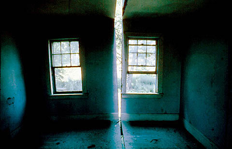
Gordon Matta-Clark had such a brief career, but what he did was so influential.  For Splitting, 1974, he took an abandoned house and cut a channel through it as if with a cheese cutter.  The house didn't fall down although the attack on its structural integrity would have been drastic if it hadn't then been subsequently demolished.  Splitting actually refers to the set of photographs Matta-Clark made of the rooms slashed by light from the narrowly sliced outside wall.  

One doesn't cut through a woodframe house as if it was a piece of cheese.  It took a chain saw to cut each roof shingle, sheathing board, beam, joist, floorboard, lathe, plaster wall, plumbing pipe, window frame, chimney breast, stair tread and riser.  The thought is conceptual, the act is laborious.  

His beautiful film:

Splitting By Gordon Matta-Clark from GM Clark on Vimeo.

Matta-Clark's work is generally seen as 'a critique of bourgeois American culture' which makes little sense to me now.  It seems what he was doing was classic modernist sculptural technique, in the way David Smith assembled and welded steel sheets and then sometimes cut the piece in half and rearranged it.  My source for this is an ancient film I once saw on his working methods where he was working with steel the way the rest of us were working with cardboard.  The difference between working with mild steel and walls of a building is perhaps financial: abandoned houses and warehouses were available the way wrecked cars were for John Chamberlain.  But because both these materials fall into the category of detritus, or found materials, or salvage, their history leads to a set of particular and peculiar narrative arcs for the sculpture made from them.  


Peter Eisenman, House VI, Cornwall, Connecticut, 1975. photograph NJITPeter Eisenman's House VI of 1975, just one year after Splitting, famously had a glazed slit in the bedroom from ceiling to wall to floor.  At the time it was discussed as an illustration of the wilfulness of the architect, forcing his clients to sleep in twin beds to preserve the slipping planes of the design process that at one (arbitrary) point stopped, was built and occupied.  Although Eisenman's slice out of three planes of the room appropriates Matta-Clark's slice out of a house in New Jersey, it comes from completely different reasoning.  

Here is a video by Steve Trefois and Laurent Arnoldi on House VI, if one has the patience.

Peter Eisenman - House VI Steve Trefois - Laurent Arnoldi from AlICe lab on Vimeo.


Monday
Oct122015

John Chamberlain: HAWKFLIESAGAIN, 2010

John Chamberlain, HAWKFLIESAGAIN, 2010. Painted and chrome-plated steel, 270 x 311 x 221 cm. Artwork Copyright John Chamberlain. Courtesy of the artist and Gagosian Gallery, photo by Mike Bruce

I'm wondering if there isn't an over-reliance on narrative in much of sculpture today.  Hirschhorn's 2015 In-Between spells out a narrative of building collapse: what it might look like, were it to happen.  As such it doesn't really look like buildings in collapse, which fall apart along structural lines unless helped by a lot of semtex.  However, it is the narrative that is important.  Jeremy Deller's 2009 It Is What It Is, has a more journalistic narrative: the bombed car is a bombed car, importantly from a specific time and place.

As a correlative, I find myself thinking of John Chamberlain's crushed car sculptures of the 1960s which, in his own words, had no weighty narratives attached, he only said they were about detritus, as that is what they were made from: 'individual pieces that are divorced from their material past' which have certain aesthetic qualities – colour, shape, shine, rust, but little 'historical indexical meaning' (these notes from a review by Anne Blood on Chamberlain's 2011 show at the Gagosian, London, the same year that he died).

However, over my adult life, these sculptures have had a zillion narratives and meanings projected on to them; even Anne Blood sees them as 'works formed like a piece of jazz improvisation, the separate pieces meeting like notes in the air, striking harmonics and chords – atonal or harmonious – but ultimately coming together into a pleasing whole' – a projected narrative of working methods, which may or may not be true.  For decades Chamberlain's sculptures were said to 'represent' the excesses of American throwaway culture, its love of big cars, speed, freeways and accidents.  They were, at one time, included in the Pop Art canon, because they used the products of American consumer culture.  They have occupied a subsection of American Arte Povera, because they investigate found materials and re-present them in a way that makes the commonplace a thing of marvel.  The archive of his works at Marfa's Chinati Foundation almost automatically enters the sculptures as land art: assemblages of stuff picked up in the landscape of dead cadillacs. But even at Marfa Chamberlain's works share space with Dan Flavin's neon tubes and Donald Judd's chrome-plated steel boxes, all industrial processes together, in various stages of assembly and decay.

After all these decades (four) can it be that a sculpture is simply the end product of its means of production (from which it derives its deep description) and not a production projecting a meaning, a lesson, a story, a parable?

Thursday
Oct082015

Thomas Hirschhorn: In-Between, 2015

Thomas Hirschhorn. In-Between. Photograph: Mark Blower

Thomas Hirschhorn's In-Between at South London Gallery has been reviewed in The Guardian under the title: 'Things fall apart: the beautiful Marxist bomb that's hit south London;  Artist Thomas Hirschhorn plays on our manic pleasure at seeing ruins by making a whole building collapse in on itself'   

But not really, it is in a gallery, which is still standing.  This is a simulacrum of a building collapsing in on itself.  Whatever he is doing, and it is explained in Adrian Searle's review, one has to ask whether or not such an installation does give us manic pleasure.  I'm not sure.  Hirschhorn quotes Gramsci's note, from Prison Notebooks, 'destruction is difficult; indeed, it is as difficult as creation'.  Well, whatever.  What is strange is that this art installation must be taken seriously in the light of the fairly simple destruction taking place in Palmyra, and the very similar images seen every day from Aleppo and Damascus.  Or even the destruction of the MSF hospital in Kunduz, which although it took half an hour, was relatively quick and one might say simple.  

Hirschhorn's ruins are actually made of cardboard and styrofoam standing in for concrete and steel, so technically, I suppose, a maquette, or a model.  He says, 'a ruin stands for a structural, an economical, a cultural, a political or a human failure' and it is failure he is giving form to.  Art is used here as an intermediary between real ruins and the causes of the real ruins, as if the lessons need to be spelled out.  Indeed Adrian Searle appreciates this.  If this exhibition is popular, does this indicate some sort of disaster fatigue amongst the general gallery-going first world public?  'oh god, another front page photo of a bombed building with little kids playing in the rubble. Can't take it in. Let's go look at Hirschhorn's ruin instead.'  

Compared to Jeremy Deller's It Is What It Is, his exhibition of the bombed car that killed 38 people in Iraq in 2007, In-Between is a limp thing, lacking in commitment and urgency,  It remains a maquette, and as such doesn't ask for much from the viewer.  Of course it is unfair writing about any work one hasn't seen, but I hadn't seen Deller's piece either, but I got it, or at least got what I needed to hear out of it.  And that is the point.  What, and how much, in any piece of art, passes a critical point whereby viewers find something to engage with, not just gaze at. In-Between seems a gesture, only. 

Monday
Mar302015

Shelagh Wakely: ground, 1991

Shelagh Wakely. Curcuma sul travertino, made up of loose turmeric scattered in baroque patterns on the travertine marble floors of the British School in Rome, 1991

What might be the opposite of all those assertive pieces of last week?  Perhaps Shelagh Wakely's large ephemeral pieces that lie flat on the floor, and if not a sheet of gold or turmeric, then small fruits and vegetables, covered in gold leaf, that slowly collapse.  Her potted biographical note shows both the RCA and a BSc in Agriculture which might be one of the roots of her affinity to the horizontal surface, its inscriptions and patterns.

©Shelagh Wakely. Partial recreation of Paisagem Inutil, 1997.   Camden Arts Centre – Shelagh Wakely: A View from a Window, 2014. photo: Marcus J Leith

Thursday
Mar262015

cloudscape: Richard Serra

Richard Serra. Corner Prop No.8 (Orozco and Siqueiros) 1983 Cor ten steel (2 plates) Upper plate: 182 x 191 x 6.3 cm 71¾ x 75¼ x 2½" Lower plate: 145 x 150 x 6.3 cm 57 x 59 x 2½"

I suppose it dates me, as does so much in this journal, to like Richard Serra's work.  This piece was in an exhibition in the 1980s of Serra and Keifer at the Saatchi Gallery – can't think of two more powerful artists at the time – it was overwhelming.  

This particular set of works was all about balancing extremely heavy sheets of steel in configurations that leant against the gallery walls, or against each other.  It was dangerous, fragile, deceptively still.  A heavy lead pipe sagged quietly in a corner.  The gallery rooms were small, silent, all that metal lying not quite inert. 

This drawing, however, from 1972, being just oil stick on paper, races off the page.

Richard Serra, Untitled, 1972-1973, Paintstick on paper, 37-13/16 x 50", Whitney Museum of American Art, New York; Purchase with funds from Susan Morse Hilles, 74.10, © Richard Serra, Photo: Sheldan C. Collins.Have always seen Serra's work as a series of registrations: of land, of physical forces, of structural properties – that intersection of a natural world of weather, people and, usually, civilised urban spaces and Serra's great slabs that in interrupting the natural order we never think about, actually point it out, heighten it, makes us think about the drones in the gallery system installing these dangerous works, or the office workers whose ant-like paths across the plaza are diverted, annoyed, or the allegedly neutral walls, floors and spaces of the gallery or museum which are forced into strenuous support of a temporary installation. The work is so structurally and formally engaged that it forces us to engage with it.

Wednesday
Mar252015

cloudscape: Hiroyuki Hamada; landscape: Luise Valdes

Hiroyuki Hamada. #73, 2011-13, painted resin, 46 x 70 x 25 inches

Found Hamada's beautiful work originally in Raw + Material = Art. Found, scavenged and upcycled, 2012 by Tristan Manco, a survey of a wide international range of artists using non-traditional materials. 
I used to find scavenged materials really exciting, especially in building: the transfer of dadaist collage to architecture, but after this book I sort of lost a bit of interest.  The work often seemed gimmicky: not arte povera so much as art clever clogs.  Hamada has quite a few of the pages from this book on his own blog  including the Chilean Luise Valdes, whose 'Cocinar', part of Casa de Karton, I quite like as it looks not unlike my own house: small, white, basic, hand finished – it reminds me of the irregular rooms hacked into the cliffs above Alicante which were all nicely tiled.  Not that my house is a sculpture, or that Valdes was building a house, but the nature of the surfaces are hand-worked, not the product of a machine or an industrial process.  This is increasingly rare to see, the marks of the hand.
 

Luise Valdes. Casa de Karton, 2008Two ends of a material scale: Hamada's resin finished like ivory with inlays and thin seams of ebony, and Valdes' whitewashed cardboard.  One immensely calm, solid and contemplative, the other earnest, fragile and beloved.  The Hamada piece above, #73, does not appear in Raw + Material = Art, but is on his website along with a number of prints of this folded shape:

Hiroyuki Hamada. B18-04.

This work is all material and shape and has gone on for years within a very limited formal palette.  Valdes is about material and material culture: form is supplied by the everyday world and as such rich and complex and intimate.  I like this pairing.

Tuesday
Mar242015

Christopher Lavery: Cloudscape, 2010 

Christopher M Lavery. Cloudscape, 2008-2010 $120,000 public art commission, Denver International Airport Emerging Public Artist Project. Steel, polygal, LED Lighting, solar panels.

Monday
Mar022015

Sara Barker: minimal stories

Sara Barker Conversions 2011 Steel, aluminium, various paints 215 x 115 x 65 cm

A different kind of minimalism, Sara Barker's work is dense with allusion and allegory based on framing absence.  The frame, by definition a marginal element, carries all the responsibility of the witness, and in Barker's work the frame is usually incomplete.  Slices of painting, normally the surface that carries meaning, are partial stories so removed from a full narrative to be just single words or lines, without context.  Yet they are bound together in a construction that captures the meaningless space of the gallery, or the studio: one feels that in their installation, wherever it might be, what is being framed isn't the story at all, that the frames hold the key to a story one must participate in without knowing what it is.  This is magic and mysterious. 

Here is a 2013 video from the Baltic in which she discusses the spatial nature of the construction processes, and shows some very large and complex works:

Wednesday
Feb252015

Giuseppe Penone: from 1970 to 2013

Giuseppe Penone. 'Albero di 12 m', 1970. Legno, cm 1213x25. Courtesy Moderna Museet, StockholmIt is a long life, art.  Penone did beautiful deconstructions of trees in the 1970s, cutting away tree rings to reveal the young tree inside a massive trunk.  Recent work, a series at Versailles in 2013, is still about trees, but there is bronze, there are castings, there are interventions in how a tree grows, there is Versailles and its Le Nȏtre landscape, there isn't much povera any more, other than the insistence that trees grow and resist sculptural intentions.  Weather intervenes; the cast tree bark is from a cedar that grew at Versailles, damaged by a storm.  And as we in the boreal forest know, beetles and climate do more to shape the environment than any number of landscape architects and gardeners.  There is an existential reality to trees – the remaking of trees/nature in the image of the divinity of man is what Penone has always resisted.  

Giuseppe Penone, Tra scorza e scorza, Entre écorce et écorce, 2003. Courtesy of Giuseppe Penone. Photo by Tadzio

Tuesday
Feb242015

Turner-Yamamoto: Hanging Garden, 2010

Sinji Turner-Yamamoto. Hanging Garden | 2010 | dead and live white birches, soil, water, metal structure/support for broken trunk, water irrigation system, | deconsecrated 19th century Holy Cross Church (National Register of Historic Places), Cincinnati, Ohio

Sinji Turner-Yamamoto, studied in Kyoto and Bologna.  Hanging Garden is part of on ongoing series (so far eleven), the Global Tree Project, with installations around the world that put trees into iconic spaces.  His website is a cloud of poetic fluff about wisdom, life and meditation; the work is more interesting.  

Arte Povera is a clear influence in this piece: the tree itself containing its own history in its structure, its surface form a tip of an iceberg of biomass.  Here it is two trees, one living and one dead, meeting at the point they enter or emerge from the earth.  A built mirror, both a small tragedy and a clever statement.

The deconsecrated 1889-1901 Holy Cross Church in Cincinnati?  What a beautiful thing.  An Irish immigrant church and an attached monastery, it suffered in the decline of the Catholic priesthood and closed in 1977.

Tuesday
Feb032015

Theaster Gates: Migration Rickshaws, 2012

Theaster Gates. Migration Rickshaw for Sleeping, Building and Playing, 2013. White Cube

Relatively speaking, not a lot out there on Theaster Gates, given how multivalent and ubiquitous his practice is. Urban design and community-building play a large part, as does a fairly conventional art practice such as the Civil Tapestry series.  He is described on his website as a Chicago-based artist who has 'developed an expanded practice that includes space development, object making, performance and critical engagement with many publics.' And wikipedia states he is 'an American Social Practice Installation artist' [wikipedia's caps].

Gates is perhaps someone who has done a lot of things: urban planning, construction, ceramics, installations and performances not unconnected to church performance.  He bought half a street in south Chicago and turned it into a community arts corridor: he has a project, he points this project to many processes and ways of making his project visible.  

The rickshaws are, like a shoe shine series, objects made from found materials: the social reference to the shoe shine stand is perhaps clearer than the rickshaw in terms of American black history, but the rickshaws are wheeled vehicles that carry the tools and materials for new lives.  The materials are embedded with old lives and old wrongs.  The form is generally two stair stringers with things stacked on top, a wagon wheel at the far end.  Similar carts figure in fleeing refugee images the world over.  In isolating the cart from all context, i.e. it has become a sculpture in a gallery, the form assumes a universality in the way that Joseph Beuys' sleds and stacks of felt, so personal and autobiographical, become a synecdoche for all cases of individual survival – if not felt and fat, then leaves, or snow, or hay, or cardboard.  Gates' Migration Rickshaws are both literally and figuratively vehicles that carry a load: it is the load that becomes didactic. Migration Rickshaw for Sleeping and Building, Migration Rickshaw for German Living, Soul Food Rickshaw for Collard Greens and Whiskey, Rickshaw for Hardware.  What is it that makes a life?  

I realise that the current term for found stuff you make art out of is re-purposed materials – discarded things whose new purpose seems to be art.  I'm not sure this is effective re-purposing, again it seems didactic: nothing is waste, nothing is too humble to be re-used.  There is a vintage, early-twentieth century look to these rickshaws that makes them so much more romantic than a steel shopping cart full of plastic bags and bottles, the more usual urban migration rickshaw these days. One could actually build something with Gates' rickshaw loads; bottles and plastic are simply articles whose only destination is molecular reorganisation at an industrial scale. There is perhaps a recovery project here, a pre-civil rights movement recovery when 'freedom' implied an individual sense of destiny and dignity, not the freedom to be shot by a neighbourhood watch idiot because you are wearing a hoodie.  

Theaster Gates. Soul Food Rickshaw for Collard Greens and Whiskey, 2012 55 1/2 x 96 7/8 x 29 1/8 in. Desk drawers, wood and wheels

Monday
Apr072014

Phyllida Barlow, dock 2014

Phyllida Barlow, dock 2014. Tate Britain, London

Phyllida Barlow is the artist chosen for the Tate Britain Commission of 2014 and her work has recently opened – riotous spills of debris from the doorways and halls of the neo-classical Duveen Galleries.

The Tate Gallery has always been about British art and there has been much problematising of its founding and its legacy: Tate & Lyle was a Victorian Quaker sugar refinery established after the abolition of slavery, nonetheless sugar as a prime commodity was part of the infamous Atlantic Triangle of the eighteenth century: Africa for slaves sent to the Americas to extract resources shipped to Europe for refinement and consumption. The International Slavery Museum shares the Albert Dock with Tate Liverpool.  Henry Tate had the Tate Gallery built to house his art collection which he donated to the state. Duveen was an art dealer whose family wealth came from importing art and antiques to Britain.  He funded the extension of the original 1890s Tate in 1926 and again in 1937.  Patrons and collectors of art – Clore: finance, property, retail, Courtauld: textiles, Tate: sugar — without them, and many others, Britain wouldn't have its public galleries at all.  

With this kind of financial, industrial and accumulative spatiality, Phyllida Barlow's work is particularly human, warm, messy, chaotic, inexpensive, temporal and ephemeral. She has worked her whole career with detritus gathered from skips and building sites.  Her project is not the diamond encrusted skull that critiques the twenty-first century art market, rather it is the making of 'things' from rich found materials, the assembly of structures from the unusable. Barlow herself saw the Duveen site as having 'two particular contradictory aspects: the tomb-like interior galleries against the ever-present aspect of the river beyond'.  dock ambles and shambles through several galleries with vast paintings pinned to complex wooden constructions that both crawl and tower.  It is, apparently, much like most of Barlow's work: massive installations that are dismantled after their exhibition, i.e. work with no commercial value but clearly of great import.

dock isn't just great piles of junk; the name itself takes one to the noise, the cranes, the hectic nature of docks from a time when they dealt with more than just shipping containers.  Once on a passenger ship docked briefly at Le Havre, I watched as a crate of wine being winched aboard fell back to the dock splintering into a pile of sticks, bleeding burgundy across the concrete.  Docks were full of tremendous incident.  Even watching logs loaded at the CPR docks in tiny Nanaimo was fraught.  

Although I can't see Phyllida Barlow's dock, from the photographs one senses that these pieces must rustle and creak – they are wood, wood always moves.  Leaving the term dock aside, as sculptures they are unfixed, they cannot be perceived without walking in, around and through them, as one does architecture.  The scope of this installation is complex and extended, it rings of bomb sites and redevelopment clearance, poverty and an obsessive love of materials, no matter what their status. 

Phyllida Barlow, dock 2014. Tate Britain, London

Friday
Jan312014

Boyle Family earth casts

Boyle Family. Rock and Scree Series, 1977. British pavilion, Venice Biennale 1978

Part of the Boyle Family Manual for the Journey to the Surface of the Earth: 'The objective of this Journey will be to make multi-sensual presentations of 1000 sites selected at random from the surface of the earth.  Between August 1968 and July 1968 blindfolded members of the public selected these sites' [by throwing darts at ever larger-scaled maps until a 6' square was found].

1. Take the actual surface coating of earth, dust, sand, mud, stone, pebbles, snow, moss, grass or whatever hold it in the shape it was in on the site. Fix it. Make it permanent.

The rest of the instructions, 6' core sample, film pan from the centre and a 100-frame film of the site, and a study of 'the effect of elemental forces' on the site were always less captivating than the casts of the site itself.  This was done with frames and plaster lifting the surface material with it when the cast was removed.  
There were more instructions for dealing with plants, animals, people, filming them, taking samples, but it was the cast that was the enduring gallery material. Accompanying texts found on the Boyle Family website are impenetrable streams of consciousness, a barrage of words working their way into description.  There is a review by J L Locher, which one suspects was written by Mark Boyle himself as it is so similar to all the other writings on this site.  But what of it, this is a body of work that started in the 1960s and continues still, this recording of the world.  

Such a conceptually simple frame produces simple objects: 6' squares of ground and it is these themselves that invite speculation, rather than the process.  They are notes from the earth, unconnected to any discernible narrative.  The squares of ground are not linked by resource-extraction, climate, cost or beauty; nationalism, history, productivity or location.  They are microscopically complex, conceptually reflexive and this is what is so interesting, that this work shared the unemotional approach to process of Sol Lewitt, in Boyle's case with the complicity of the earth, and that makes all the difference.   

Wednesday
Aug282013

Richard Wentworth: the ladder's shadows

Richard Wentworth. 35°9,32°18, 1985. Steel and aluminum, Tate Gallery T07168

Wednesday
Jul172013

Andy Plant: orrery, 1997

Andy Plant. Orrery built for the 1997 Stockton Theatre Festival. A 40′ high, temporary outdoor floating sculpture, where a rotating orrery, with planets, is operated by a performer inside the main sphere.

Thursday
Apr112013

Ed Ruscha: Twentysix Gasoline Stations, 1962

Ed Ruscha. Twentysix Gasoline Stations, 1962

The 26 stations were on the highway from Los Angeles, where Ruscha lived, to Oklahoma City where his mother lived.  In an interview for Artforum, Feb 1965, he said "I have eliminated all text from my books – I want absolutely neutral material. My pictures are not that interesting, nor the subject matter. They are simply a collection of 'facts'…"   By 1982 he positioned the gas stations metaphorically, akin to the Stations of the Cross, but he was older then.  

Ruscha took 60 stations, edited them down to the 26 most un-eloquent photographs, and published them without any text.  Dave Hickey has written about the kind of numbness that happens when one drives, repetitively, long distances; he mentions John Baldessari's 1963 documentation of the back of every pickup truck he passed between Los Angeles and Santa Barbara.  In 1985 I took a photograph out of the side window every 50 miles between Duncan, BC and Halifax, NS, a trip I had done several times.  Fifty was a round number, there were 72 slides, 2 rolls of film exactly – the curious thing was that the 50-mile slices missed every city, so it was a long trail of rocks, trees, horizons, mountains, trees, highway guard rails, trees and one very small town in New Brunswick.  The only narrative was the process, something that was very exciting.  All the deconstruction of motive and meaning came later.

Ruscha photographed the trail of gas stations for all sorts of painterly reasons: serials, ready-mades, a rejection of aesthetics, photography as surface linked to the surface conditions of pop art, the iconography of the everyday.  Plus, there was Kerouac and Cassidy's spooling out of On The Road, and there were cars, cars, cars.  John Chamberlain's crushed car sculpture, Billy Al Bengston's car-enamelled panels: the car was a material with which one could make art.  

Monday
Mar182013

David Nash: wood

Anne Purkiss, photographer. David Nash in his studio, 1999.

Anne Purkiss started in 1985 to photograph members of the Royal Academy of Arts.  This one, of David Nash was probably taken in 1999 when he became a member.  He is in his studio next to a mining tip in Blaenau Ffestiniog, a Victorian slate mining town in Gwynedd, Wales.  It is no surprise that with the decline of the use of slate, there would have been many industrial spaces surplus to requirements; many of which would make capacious studios.  

His material isn't slate, it is trees. From wikipedia's description of Wooden Boulder: 'begun in 1978, this work involves a large wooden sphere carved by Nash in the North Wales landscape and in 1982 left there to weather. Over the years, the boulder has slipped, rolled and sometime been pushed through the landscape following the course of streams and rivers until finally it was last seen in the estuary of the River Dwyryd. It was thought to have been washed out to sea but, after being missing for over five years, the boulder reappeared in June 2009. Indications are that it had been buried in sand in the estuary.'   

How heroic.  

David Nash. Wooden Boulder, 1978-2009

Thursday
Dec132012

oyster shell middens

John Heron, Hidden Midden 1. 2011

We are talking about numbers of oysters at an almost inconceivable scale: there is an Oyster Shell Beach in Hong Kong, Oyster Bays in both New York and New South Wales, Oyster Creek in New Jersey, Oyster Point in San Francisco, Oyster Cove on Vancouver Island, Oyster Bed in Prince Edward Island.  There is an Oyster, Virginia.

Oyster middens can be miles wide: two kinds, the discards of oyster-eating peoples, and natural banks of oyster shells on beaches.  According to Kaitlin Pomerantz, the erosion of empty shells releases calcium into the water needed to build new oyster shells, plus providing a foothold and a habitat for new oysters.   

However, tons of oyster shells were used as road beds in the early twentieth century; more tons were ground up for chicken feed and agricultural use.  It is a similar story to the mountains of buffalo bones photographed beside the CPR line in Saskatchewan in the 1890s: destination, fertiliser.   Oysters are under threat from over harvesting and the removal of habitat. So, nothing new then.  

Pomerantz has built a monument, Hidden Midden, for Chesapeake Bay (between Maryland and Virginia), not quite as tidy as the drawing above, but better: it is topped by a slab of asphalt road that registers the destruction of oyster middens, and offers a footfall for occupation, not for oysters unfortunately given that it is in a sculpture garden, but for other kinds of life.

Kaitlin Pomerantz, Hidden Midden, Annmarie Sculpture Garden, Solomons, Maryland. November 2011.