Entries in painting (46)

Monday
Apr032017

21039 Pacific Coast Highway life

David Hockney sitting in the living room of his Malibu house, March 1988 Photo: © Condé Nast Archive / Corbis Artwork: © 2015 David Hockney

The streetview of Hockney's beach house studio (below) is quite bleak, and yet inside 21039 Pacific Coast Highway when Hockney worked in it exploded with light and colour.  Above is a photo of Hockney in the beach house: the jungle of plants through the window, the bright furniture, the brilliantly white walls.  I should think that growing up in Bradford during the war and the bomb-damaged 1950s and then being teleported to sunny California of turquoise and hot pink would hit all the rods and cones of the eye like a thunderbolt.  So gay, in the old sense of the word, so carefree.  So sun-filled.  So primary.  

Below is his 1980 painting, Mulholland Drive: the Road to the Studio.  Compared to the actual road to the studio there is something spiritual about the colour.  This is more than just using acrylics straight from the tube, it is an affirmation of an intensely vivid new life.

David Hockney. Mulholland Drive: The Road to the Studio, 1980 acrylic on canvas,  86x243 in.

Monday
Mar272017

David Hockney. A Bigger Splash, 1967

David Hockney. A Bigger Splash Acrylic paint on canvas, 2425 x 2439 x 30 mm. Tate T03254

This very well-known painting epitomises all the burnt landscape/blue tiled pools of California that are so romantic to those of us from different landscapes.  The image is of one of those minimalist modern tract houses of Los Angeles.  The Kaufmann House was a beautiful example, but in the 1950s and 60s all little suburban LA houses had a pool. 

Hockney painted this one with a roller and Liquitex — a discussion about painterliness, image and surface that was intense at the time.  The traditional surfaces of art were vehicles for the depth of field and the rendering of image.  The painter's skill was measured in its passion and its verity.  Postwar abstraction focussed on the surface itself, not the image.   In The Bigger Splash, the painted part floats in a larger square of unpainted, unprimed canvas: it clearly is acrylic paint flatly applied to material stapled to the wall, a rejection of the centuries of priming and underpainting, working and reworking in oil paint to the edges of the stretchered linen ground.  The part that is painterly, the splash, was done with brushes, but the splash itself was something Hockney found in a book of photos of swimming pools.  It wasn't about direct observation from the side of the pool, but rather direct painting from a photograph, another transgression of expected fidelity to a visual experience.  This was a figurative work assembled like a collage of banal images and as deep as banality can be.  

It is in such a thin, un-reflexive, uninteresting world that one can remake oneself — is this not the dream of the new world, without class, history, social conventions and repressive social narratives?  Of course 1960s southern California was not without its class by wealth, division by race and services by ethnicity, but if you had come from grey, cramped, mingey, prissy England of postwar rationing and criminalisation of homosexual acts, Los Angeles must have been a nirvana for a young white artist with an excellent education and something to say.  

If you take every artwork you see as a thesis, rather than as an image, much is revealed.  Everything means something.  Painting in Liquitex with a roller isn't a casual act, it is right at the centre of the nexus of abstraction and conceptualism.  Copying a photograph continues Andy Warhol and Richard Hamilton's late-1950s appropriation of images in the public domain.  And yet, and yet, it is the image of a bigger splash, used as the title for a Hockney documentary, many reconstructions of the pool and the house online, reworking of the image itself as homage, as graphic design, as really dreadful reassemblies.  Just look at Hockney+splash on Google images.

Secretly I think we all still would quite like to live in southern California, in a little modern flat-roofed house with a pool.  It is a bit of a dream, still. 

Wednesday
Mar222017

David Hockney. Pearblossom Highway, 11 - 18th April 1986

David Hockney. Pearblossom Highway, 11th-18th April 1986, photographic collage, 77x112 1/2 in. © 1986 David Hockney

Another desert landscape made familiar by cowboy movies and Paris, Texas; this though, the Pearblossom Highway in California, north of the San Gabriel Mountains which you can see on the horizon, otherwise known as State Route 138. 

The Getty quotes Hockney on this piece:   'Pearblossom Highway' shows a crossroads in a very wide open space, which you only get a sense of in the western United States. . . . [The] picture was not just about a crossroads, but about us driving around. I'd had three days of driving and being the passenger.  The driver and the passenger see the road in different ways. When you drive you read all the road signs, but when you're the passenger, you don't, you can decide to look where you want.  And the picture dealt with that: on the right-hand side of the road it's as if you're the driver, reading traffic signs to tell you what to do and so on, and on the left-hand side it's as if you're a passenger going along the road more slowly, looking all around. So the picture is about driving without the car being in it.

Well, that makes sense if you are in a right-hand drive car, as one is in England, but not in California.  Is driving one of those automatic things that has cut channels in the brain that insist that although sitting on the left hand driver seat, one is spatially seeing the world from the passenger seat because that is how you learned to see in a car in England?

For a North American, this photocollage tells me the passenger is worried about where he is, and the driver is the one noticing the details, as one does, at the side of the road.  On long haul drives, peripheral vision is very alert. This allows you to read a book on the steering wheel while driving the I-25 through Wyoming, one large beige halfpipe.  Well, when I was younger.

The mid-1980s was the heyday of the photo-collage for architects: how to show a site, not with the single Renaissance eye focussed on the far horizon, but more the sense of a place full of details that a single 35mm shot simply cannot include.  I remember taping together 180° site pans in the 1970s and, photoshop aside, we were still being sent photo collages in the mid-2000s: e.g. Rufina Wu's underground Beijing rooms in On Site review 22:WAR, 2008.

Hockney is a painter, not an architect documenting a site, but both used the documentary truth of the raw photograph, without the limitations of the camera, to make a different reality based on perception rather than fact. 

This is a pre-digital conversation.  

Hockney's Pearblossom Highway does record the throbbing relentless desert sky with headachey accuracy.

Wednesday
Mar012017

Richard Diebenkorn: Notebooks, 1943-93

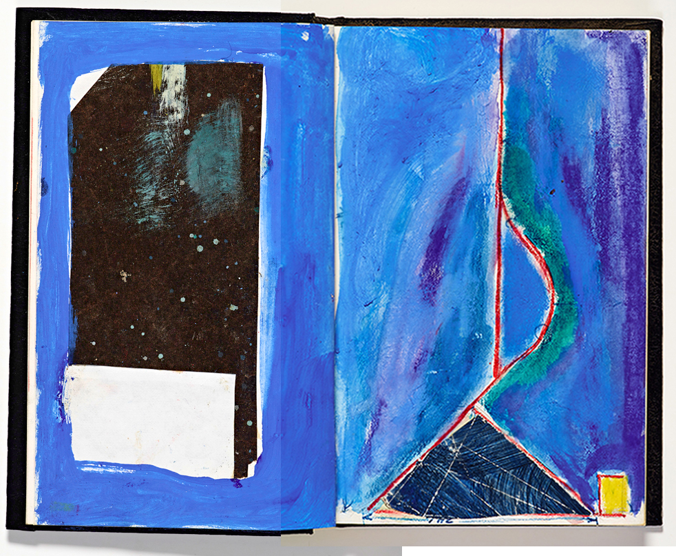
Richard Diebenkorn, “Untitled” from Sketchbook #2, pages 33-4 (1943–93), gouache, watercolor, crayon with graphite and cut and pasted paper on paper (gift of Phyllis Diebenkorn, © The Richard Diebenkorn Foundation)

Alison Meier describes Diebenkorn's 29 sketchbooks as 'a sort of nomadic studio', an apt concept: the emergency kit for ideas, the travelling bank of lifesaving notes.  They must have been everywhere as they are all listed as 1943-93, always in play, just grab a notebook handy and add a page or two.  Nothing here indicates the notebook as chronological recording of one's development; there appears to be little reflection on one's art as continuum, nicely dated.  No, these are simply files, unfiled, but like going through a box of unsorted slides: with each one the time, the heat, the place, all come rushing back.  

It also says something, this disinterest in chronology, that all the work, the thoughts, the ideas, are on an equal footing.  Early drawings, done with uncertain youth, are still around simply because they are in the notebook with the green cover, or the black spiral, or the one with the red paint on the outside; vaguely interesting, occupying a slim bit of notebook real estate next door to a vivid crayon thing done forty years later.  Plus they might have an idea in them.  

Painting is not like writing.  The physical act of placing one word after another, and another, page after page itself is linear, sequential.  Even the white space of concrete poetry contributes to the order of the poem, even erasures, crossings out and the reworking of writing disappear in print, usually its ultimate destination.  Painting itself is a constant reworking of surface, three-dimensional, un-linear, a storm of marks that are never actually finished, rather they are abandoned.  Famously De Kooning continually reworked his canvases, they were never finished, they are dated by duration.  This quote, source unknown but found here, 'I paint this way because I can keep putting more things in it - drama, anger, pain, love, a figure, a horse, my ideas about space.'  Have to trust what might be a dubious source, however, it says something about using the canvas as a notebook that keeps getting added to.  Willem's notes on women.

Diebenkorn's notes on land. places. people.  They have been given to Stanford by Phyllis Diebenkorn, a rather wonderful bequest that one can see here in an interactive display.  museum.stanford.edu/diebenkornsketchbooks/

Richard Diebenkorn, “Untitled” from Sketchbook #16, (1943–93) (gift of Phyllis Diebenkorn, © The Richard Diebenkorn Foundation)

Monday
Mar142016

Métis couture: Belcourt and Valentino

Valentino Resort 2016

Christi Belcourt, Water Song, 2011. acrylic on canvas The difference between this and D2’s appropriation of aboriginal garments, is that Valentino asked; it was a collaboration between Belcourt, her painting Water Song, and Valentino fabric designer Francesco Bova.
It is both Métis and métissage, this collaboration of painting and fabric printing, Métis culture and Italian couture.  The garments are Valentino; the surfaces are Belcourt. 

Thursday
Nov052015

Peter Lanyon: Thermal, 1960; John Gillespie Magee: High Flight, 1941

Peter Lanyon, 1918-1964. Thermal, 1960. Oil on canvas, 1829 x 1524mm. Tate T00375, purchased 1960.

If there was ever a painting that matched John Gillespie Magee's High Flight, below, it is Lanyon's Thermal, above.

Oh! I have slipped the surly bonds of Earth
And danced the skies on laughter-silvered wings;
Sunward I’ve climbed, and joined the tumbling mirth
of sun-split clouds, — and done a hundred things
You have not dreamed of — wheeled and soared and swung
High in the sunlit silence. Hov’ring there,
I’ve chased the shouting wind along, and flung
My eager craft through footless halls of air....

Magee was in the RCAF, Lanyon RAF; Magee killed at 19 in 1941, Lanyon survived to buy a glider and paint what he saw into the early 1960s.  There is a resurgence of interest in Lanyon because of a new exhibition at the Courtauld.  Well-known, but not well-featured, but now there are articles on him everywhere, Thermal explained, Silent Coast discussed: the point where abstract expressionism met English landscape.  
However it is explained, what I see in Thermal is that 1960s Austin side mirror shape that gives the whole painting its scale from the era to the plane, to the air outside it.  

Silent Coast, below, just from the name alone, tells us it is an aerial of a coastline, beautiful but less magical than Thermal, which is complex, difficult. 

Peter Lanyon, Silent Coast, 1957. oil on masonite, 122 x 93.6 cm, Manchester City Galleries

Perhaps surviving WWII (Lanyon was stationed in the North Africa theatre, dangerous, but not as lethal as John Gillespie Magee's Sqd 412, an RCAF bombing squadron flying over Europe where an aircrew's life expectancy was about two weeks) – perhaps surviving WWII made Lanyon particularly free.  For those who did survive, the war had been the high point of their lives and they'd made it through.  The last verse of Magee's High Flight actually does not seem to end, so sublime is the moment of flight.  Like Thermal, it is entirely absorbed in the act of flying, where survival, or not, is in the future and hardly to be thought of.

Up, up the long, delirious, burning blue
I’ve topped the wind-swept heights with easy grace.
Where never lark, or even eagle flew —
And, while with silent, lifting mind I've trod
The high untrespassed sanctity of space,
- Put out my hand, and touched the face of God.

Thursday
Apr022015

Richard Diebenkorn: planar terrain

Richard Diebenkorn, Ocean Park #79, 1975. Oil on canvas, 93 x 81 inches. Philadelphia Museum of Art, Purchased with a grant from the National Endowment for the Arts and with funds contributed by private donors, 1977. ©The Estate of Richard Diebenkorn

Diebenkorn's Ocean Park series, which extended over many years, put landscape into a set of geometric relationships: planes which align, or not, across a terrain. The etching below, #6, 1978 is like a working drawing for a landscape painting, even one as traditional as Berkeley #23 of 1955.

Richard Diebenkorn, #6 from Six Softground Etchings, 1978; etching, 39 7/8 in. x 25 7/8 in. (101.28 cm x 65.72 cm); Collection SFMOMA, Purchase; © Richard Diebenkorn Foundation; photo: Don RossRichard Diebenkorn, Berkeley #23, 1955; oil on canvas, 62 in. x 54 3/4 in. (157.48 cm x 139.07 cm); Collection SFMOMA, Gift of the Women's Board; © Richard Diebenkorn Foundation

Wednesday
Mar042015

Agnes Martin: 1912-2004

Agnes Martin, Untitled, 1963

The minimalist of all minimalists, Agnes Martin, presents us with surface, often inscribed to a numbing field of equivalence.  She came from Maklin Saskatchewan (born on a homestead NW 19-38-27-W3), grew up in Vancouver, moved to the States at nineteen, taught through the 30s and 40s, moved to New York for the 60s, discovered Taoism and Zen and ended up spending the rest of her life alone in New Mexico.  Below is a minimalist interview: talking Agnes Martin in front of a white stucco wall, fixed camera – a numbing field of equivalent statements about not being an intellectual, or having ideas: she just responds to the inspiration. I'm not sure exactly what that is, but it leaves her with a clear mind, she says. 

Above: interview by Chuck Smith & Sono Kuwayama with painter Agnes Martin at her studio in Taos in November 1997. longer version here


Agnes Martin in her NY Studio, 1960. Photo Alexander LibermanAn earlier image, when studios were uninhabitable and unheated spaces. Martin's work demands contemplation; there is no image, just surface which has been touched, by her. The importance of Martin to twentieth century painting, and her massive influence on the conceptualists, mocks, a bit, her statements at 85 that she has an empty mind and so when inspiration crosses that empty field she can see it.  Painters are rarely wordsmiths, most are inarticulate when talking about their work after a lifetime of doing it.  I'd rather see an interview of Agnes Martin at 48 as she was in this photo when New York was the centre of the new art world afire with experimental art, when critics such as Rosenberg and Greenberg were defining and undefining painting and installation.  On the other hand, perhaps she was seemingly as unconnected to things then as later, but the climate of ideas picked her up and ran all over the field with her.  In the interview she sounds overly simplistic, and one wonders if this was a terrific defence – goodness knows the robust masculinity of the twentieth century New York art scene made short work of women artists.  To be a Taoist and to work minutely, almost obsessively, on huge canvases must have been unassailable.

In a fine and revealing essay in artcritical, Deborah Garwood mentions the increasingly violent politics of 1960s America: Vietnam, the Civil Rights Movement, the Weather Underground.  In such a world the calm, investigative studies that are Martin's works from the early 1960s perhaps codify that turmoil – the grain of sand that contains the universe.  Much has been written of her shared sensibility with John Cage: both erase noise and let the ears and eyes register some sort of deep space.

Saturday
Dec202014

panoplies of war

Robert Longo. Untitled (Ferguson) Diptych, 2014. Photograph: Petzel GallerAfter writing about Robert Longo's drawing of Ferguson, in the previous post, I kept thinking of another battle painting featured on Amanda Vickery's The Story of Woman and Art, Lady Butler's 1874 Calling the Roll.

Elizabeth Thompson, Lady Butler. Calling the Roll After An Engagement, Crimea, 1874. The Royal Collection, London.And this led me to John Singer Sargent's Gassed, of 1918:

John Singer Sargent. Gassed, 1918. The Imperial War Museum, London

From the Civil Rights Movement:

Martin Spider, Troopers charging marchers at the Pettus Bridge, Civil Rights Voting March in Selma, Alabama, March 7, 1965. Reproduced after: Steven Kasher, The Civil Rights Movement: A Photographic History, New York 1996, 179And lastly, because by this time it seems so obvious, the frieze on the entablature of the Parthenon:

Entablature Frieze on the Parthenon, the Acropolis, Athens, Greece. 447-432 BCThere is something about the linear array of warriors that perhaps has its roots in the rendering of the endless wars – war as a permanent state of existence – between gods, states and cities of the eastern Mediterranean.  Sargent's Gassed is an oil painting, but acts visually as a bas-relief: little depth of field here, and what is in the background is a smaller repetition of the foreground. 

Lady Butler is known for a new sensitivity to the reality of war; conventional paintings of British heroism portrayed the heart of battles, all glory and snorting horses, rather than the ongoing grind of war.  The Roll Call showed British soldiers in a state of extreme and weary collapse, after the battle, not in the battle.  The Grenadier Guards are not shown in their full complement, but are crowded into a dark cluster of wounded spirit.  This was the ordinary, unheroic side of war, a depiction unusual for its time.  Now, I cannot find anywhere that says that Lady Butler actually saw a battle. Sargent was there, Longo wasn't, Martin Spider clearly held the camera.  The painting is not necessarily a witness, rather it supplies a narrative needed, politically, by certain groups at the time.  The nineteenth century British Army needed reform, mid-twentieth century America needed suffrage, The Great War needed an ending, early twentieth-century USA needs to re-examine the licence and the impunity given to its institutions of law and order. 

The Parthenon frieze aside as it is included here for its formal structure, in all of these artworks we see the backs of men, the artist is a viewer from a distance, not gassed, not beaten, not weary. The men do not pose for the artist, or as is the unspoken intention, they do not pose for us, thus they do not accuse.  That is left for the artist to do. 

There is a horizontal datum line through the heads in these pieces, above is an empty air, below all is struggling uncertainty. There is no perspective, and perhaps no perspective can possibly justify these scenes.  We are not asked to engage, the precision of the row exludes us, we are forced to simply gaze at the panoply, and this shocks us.  And it shocks us into muteness because the subjects can't or won't hear us. 

Monday
Jul212014

Air Ocean World


Buckminster Fuller. Air Ocean World Dymaxion Map, 1946

part of Fuller's Dymaxion World Map Patent: click on the image to see the whole patent. The critical paragraph: 'It is an object of my invention to provide a sectional map of the world, or of a portion of its surface, which is so constructed that its parts can be assembled to give a truer over-all picture of areas, boundaries, directions and distances that is attainable with any type of plane surface map heretofore known.' Was this a mathematical/geometrical puzzle? One must always remember how interlaced Fuller's researches were with military problems. Fuller's Dymaxion 1946 cartography patent.  Oh these patents.  Such energy has been expended in mapping to render the three-dimension sphere on flat paper without distortion, or at least with understandable distortion.  We no longer understand such distortions but there is a lively discussion of the politics of map-making, several of which we had in On Site review 31: mapping | photography. The Dymaxion map is an icosahedron where to preserve the actual shape of the continents and oceans, bits are lost in the edges of each triangular excerpt.    

Dymaxion: dynamic, maximum and tension.  It was Fuller's mantra, but it is quite surprising how far his ideas spread: far beyond domes and living off the grid.  Most of his work in housing and cars was done before WWII, and little was financially viable.  After, he mostly wrote and lectured and this is where his influence sank deep into the postwar American art movement.  Black Mountain College also keeps reoccurring as a site where everyone met everyone else, John Cage especially.  1948-50 or so seems to have been a period of wide-open possibility where all disciplines were in intense conversation with each other. 

Jasper Johns. 'Map (Based on Buckminster Fuller's Dymaxion Air Ccean World), 1967. Hans Namuth and Judith Wechsler, 1990. Distributed by MoMA, Circulating Film Library. From the MoMA description: 'a portrait of the artist at work. The film begins in 1972 with Johns repainting Air Ocean World based on Buckminster Fuller's dymaxion Map. Johns work is traced over the next eighteen years. His Untitled, 1973, with its cross-hatching, flagstones, and anatomical parts become recurrent motifs, as Johns begins to imbed skulls and severed arms in them. The paintings become more personal as Johns gradually 'drops the reserve' in his recent series, 'The Seasons'. The film culminates with Johns working on the final state of the etching based on 'The Seasons'. There is no narration as such. Jasper Johns speaks at various points, John Cage reads Johns' statements, then rearranged through a computerized method based on the I Ching, curator Mark Rosenthal comments on several stages of Johns' work, and Christopher Ricks reads passages from Beckett's Foirades/Fizzles.'
In 1990, Hans Namuth and Judith Wechsler made a film about Jasper Johns: Jasper Johns: Take an Object.
It begins with Jasper Johns painting a huge dymaxion map (destined for Expo 67, now in Cologne's Museum Ludwig), Janis Joplin on in the background.  Then comes John Cage reading a selection of Johns' statements: 'art is either a complaint or an appeasement'.  One can see traces of the map that keeps occurring in the way patches of colour or marks or objects sit in some folded relationship on the canvas. But that aside, this is a truly rivetting film, and reminds me again of why Jasper Johns is so important.  

Wednesday
Mar052014

John Thomas Serres: an artist in the Channel Fleet, 1799-1800

John Thomas Serres, Point de Roquilon, France. Captain M. K. Barritt. Eyes of the Admiralty: J T Serres, An Artist in the Channel Fleet, 1799-1800. London: National Maritime Museum, 2014. Image: United Kingdom Hydrographic Office. Don't think you'll find it on the UKHO website however, this appears to be a working website of great complexity for contemporary documents, maps, charts and shipping publications.

About the time I was young and tooling around on a little sailboat in Nanaimo Harbour, I found a book of drawings of the BC coast done by an artist on Captain Vancouver's ship. They looked much like Serres' paintings (above) – navigation charts, meant to point out signal points, rocks bays, harbours and dangers.  These and Vancouver's drawings, which I've never been able to find again, delineated land, not from land itself but from an opposing position on the water.  The land is the objective other.  

It is interesting, from our map-dominated representations of land today, that in the eighteenth century elevations were as necessary as reckoning by the sun: they are visual one-to-one maps without translation to a plan.  Of course they eventually had charts, but Vancouver was in uncharted territory: a drawing or a painting bypassed translation, gave the context and the scale of the coast, especially if it was potentially hostile.  

From the water, the land-bound built environment is very small – a toytown between the sky, the mountains and the sea, all huge. Even approaching a city such as Vancouver by ferry, its complex urbanity is itself but a pale cluster, not very tall, almost irrelevant.  From the middle of the strait one can see that the Island is the top of a mountain range, that the strait is full of small islands, that there are dozens of boats from tugs to freighters, container ships to barges: daily life on a terrain that remains mysterious to those on land.

Tuesday
Feb112014

Anselm Kiefer: Alkahest, 2011

Anselm Kiefer. Oh, ihr Stimmen des Geschicks, 2011. Oil, emulsion, acrylic, shellac, charcoal, lead and iron object on photograph on cardboard 83.5 x 113.5 cm (32.87 x 44.69 in). Galerie Thaddeus Ropac, Salzburg

Alkahest is a series of large paintings, paintings on photographs and assemblages that site mountains as places of material transformation where water dissolves, ultimately, stone.  According to the press release statement from the Galerie Thaddaeus Ropac that showed this work in 2011, the term Alkahest comes from alchemy and indicates that anything can be dissolved by some solution, in this case, simply water, which through the processes of erosion dilutes whole mountains into mud.

The geologic reality of this is mirrored, for Kiefer, by spiritual battles found in German literature from Hölderlin and Goethe's poetry of the eighteenth century to Heidegger, and in Norse and Christian mythologies with their voluminous and powerful metaphoric imagery.  This image above, O Voices of Destiny (a phrase from Hölderlin's late poem 'Greece'  — O voices of Fate, their paths of the wanderer!), is Thor's Hammer, the weather maker for us mere mortals.    

This wonderful slippage in and out of metaphor and geology grounds the most enormous of world processes in the completely mundane experience of something like being caught in a June sleet storm in the Kananaskis.


Chris Conway. The flank of Mount Hart-McHarg through the cloud and snow showers of an approaching spring storm at Upper Kananaskis Lake. Kananaskis Lakes, Rocky Mountains, April 20, 2013The name Kananaskis isn't even the aboriginal term for the area – it was named by Palliser after a local man who recovered from an axe wound, a story that only dates from 1857.  I'm feeling culturally bereft here: German poetry, Norse myths are not mine, aboriginal structures of meaning are not mine either, the tenets of Christianity are stories rather than belief and the worst of it, given our current preoccupation with resource extraction, is that Kananaskis ranges were only explored in the first place in case they held gold.  They do have the less glamorous coal, and lots of ski trails put in for the 1988 Olympics.  

Kiefer's work comes out of a deep sense of his own German culture, which is why he spent years dissecting and reworking the second world war, and has continued working back and forward into mythology, geology and German philosophy: it is within him.  Settler colonies have such shallow roots: hair roots so lightly attached to the soil that it pushes phenomenological experience to the forefront. Interesting, but self-validating, and rarely linked to any sort of deep traditions. For this country, mountains mean mining and sports.  period.

Monday
Jan202014

Paul Nash: Wittenham Clumps, 1943-4

Paul Nash. Wittenham Clumps, 1943-4. oil and pencil on canvas, 24 1/8 x 29 3/4 inches. Tate T04157

The Tate catalogue entry says this sketch is one of Nash's rare unfinished paintings that he saved, then goes on to point out what it wrong with it: the curved shape in the centre is too large for the sun or moon, too precise for a cloud, probably the beginning of a parachute; abandoned as unsatisfactory.  But he didn't paint over it, so it must have said something to him worth retaining.  

The trees on the top of the hill he had painted in 1914, revisiting it in the mid-thirties and again in the mid-forties.  The trees sit like a fort on the rise, or pillboxes, or gun emplacements: this was the middle of the war. Was it possible to view a landscape after two wars as anything but strategic terrain? Was this painting left unfinished as the curved shape had entered the painting as an unwelcome visitor?  Nash was a surrealist: the curved shape doesn't have to be anything other than some harbinger of dread.  Perhaps he couldn't go on with it.

It reminds me of Man Ray's Observatory Time, a painting done in the 1930s where Lee MIller's lips float in a mackerel sky, and used here in 1936 in a photocollage of nude and chessboard.  There were no rules, however lots of people still try to tell us what things 'represent'.  They represent nothing accessible, but they do tell us things.

Man Ray. Observatory Time: The Lovers, 1936Very curiously, Paul Nash has come my way twice recently.  One contributor to On Site review 31: cartography + photography, Robin Wilson, found us through a post I'd done on Nash (the surrealism of ordinary things) in 2010, and Will Craig is writing a piece on the contradictions of modernism and nationalism as found in Paul Nash's work.  The time must be right to look at Nash again. 

Monday
Nov252013

Wayne Thiebaud's San Francisco

because it is just so beautiful.

Thursday
Nov072013

how to write a well-proportioned letter

&! Art of Signwriting, 1954

&! Art of Signwriting, 1954

Thursday
May232013

another side of Ellsworth Kelly

Ellsworth Kelly, Méditerranée 1952 Collection of the artist © Ellsworth Kelly Oil on nine joined wood panels, three in relief 150.5 x 193.7 x 7cm (photo courtesy of: http://www.tate.org.uk)

This is a really interesting interview with Kelly and Christopher Grunenberg, about colour, originally posted on one of the Tate online magazines but no longer available.  It was re-posted on fARTiculate here.

Tuesday
Dec182012

Alison Watt

Alison Watt. Sabine, 2004. ©The National Gallery, London

Wednesday
Jan042012

Frank Stella

Frank Stella. The Pequod meets the Bachelor (B-11, 2X)

I used to quite like Frank Stella's work because he used the tools of our trade: protractors, compasses and by the mid-1980s, french curves and something all the notes about Stella call railway curves.  When I was teaching in Halifax in the mid 1980s I bought a set of ship curves, it being a ship-building sort of place. One was about three feet long.  I was working on an architecture that would result if one did all the drawings using these curves: flat, gentle sweeps where even the intersections gave a slightly odd, open angle.

I saw Stella's Pequod series in New York, somewhere; all the pieces of a drawing that normally indicate some sort of coded ground plane, as in a site plan, were lifted off the ground and floated in a complex set of layers. These layers, which had shapes recognisably from french curves, were painted over with gaudy pattern.  These pieces cast wonderful shadows: another kind of drawing.  They were enchanting.

Thinking about these works and the legacy of the abstract expressionists of New York given that Frankenthaler and Chamberlain both died last week, and looking up the Pequod series (I had forgotten all the Moby-Dick chapter heading names: Pequod meets the Bachelor, Pequod meets the Virgin, and so on), I found this description: 'In this and other ways, they tackle the issue of narrative, visual metaphor and subject matter more directly than before.'  This was written in 1989, and god knows I was keen on narrative and textual matters then too, but looking at the work now, seeing everything as narrative and metaphor does the physicality of this work a disservice.  Pequod meets the Bachelor is a nice reference to an American classic about obsession and is perhaps a metaphor for the artist in an obvious sort of way, but it isn't inherent in the work. The work has a physical presence quite independent of the haze of words around it.  

Here he is in 1972, very articulate and 34 years old.  At one point he says he became interested in aluminum paint as it was fairly repellant, all the action is on the surface.  Surface was the issue, not metaphor.

Tuesday
Jan032012

John Chamberlain, 1927-2011

John Chamberlain. Chili Terlingua, 1972-1974, from a group of ten sculptures constructed on a ranch near Amarillo, Texas, between 1972 and 1975 and loosely named after towns and counties throughout the state. The works were purchased by the Dia Art Foundation and given to the Chinati Foundation in 1986.

Art - regardless of when it was made - is one of the few things in the world that is never boring, and, it costs nothing. You don't have to own it, you just have to perceive it; art is free. As an artist I give away more than I would if I ran a beauty shop.
                                  John Chamberlain, 1982

What an odd thing to choose as an alternative to being an artist – a beauty shop.  Chamberlain started working with car bodies in the late 1950s: new world collages of the built-in-obsolescent auto industry rather than in the tradition of European collagists whose work was, by the 1960s, inevitably browned and archival looking: the tram tickets of Schwitters, the futurist fascination with machine parts drafted by Duchamp.  When the  crash of car hoods and crushed doors appeared with Chamberlain, it all looked new and very American.  The earliest pieces are often rusted – cars found in fields, but later in the 60s and 70s when cars were beautifully enamelled in candy colours, these crushed car assemblages took on a painterly quality.

At the Chinati Foundation, the collection of old buildings and workshops in Marfa, Texas founded by Donald Judd in the mid -1980s to exhibit his own work and that of Dan Flavin and Chamberlain, there is a permanent building of Chamberlain's sculptures.  They tilt, they lean, they surge like Rodin's Burghers of Calais. They are noisy with parts and colours.  Chili Terlingua, above, lives there.

Monday
Jan022012

Helen Frankenthaler, 1928-2011

Helen Frankenthaler at work from the Ernst Haas Estate Portaits.

Helen Frankenthaler died last week.  She was, they say, the first, even before Morris Louis, to pour paint on unprimed canvas in great watery washes.  In the late 50s when this was happening she was 30 or so, a time when one is completely free and experimental.  All the training is done, there are few of the expectations that come with fame and age, rules are all of a sudden irrelevant. 

Frankenthaler's work was part of an explosion of American abstraction in the 1950s and 60s and formed my own way of seeing.  By time I was reading Harold Rosenberg's The Tradition of the New in the very early 70s – my then bible for everything, Frankenthaler, Twombly, Rauschenberg were washing away de Kooning, Pollock and Franz Kline who had just preceded them.  This new unprimed abstraction seemed more romantic, more minimal, astoundingly beautiful – it wasn't all about manly force, sturm und drang. Even now, looking back at it all, it appears more lyrical and even in the sweep of the body, above, more like handwriting.  Above all, Frankenthaler's work, no matter how simple the image, never implies a rush of action, instead the marks of her actions are slow and thoughtful. 

Helen Frankenthaler. Other generations, 1957. oil on canvas 174.7 (h) x 177.9 (w) cm signed and dated lower right, red oil, "Frankenthaler/ '57" National Gallery of Australia 1973.330