Monday
Feb202017

Hal Leavitt: Morse Residence, Palm Springs 1961

Tom Blachford, photographer. Morse House, Palm Springs, from Midnight Modern: Palm Springs Under the Full Moon. Brooklyn: Powerhouse Books, 2016

What I like about this particular Hal Levitt house (Theodore & Claire Morse Residence) is how horizontal it is, as is the 1957 Thunderbird: one could cast a level on the body and have it precisely parallel to the road.  This was the kind of house that even on Vancouver Island in the 1960s, signified Architecture, rather than the cottagey English-y steep-roofed 1930s houses we were all living in. For most at the time, this kind of modernism, prosetylised by Sunset Magazine could only be exercised in the yard: breeze block walls proliferated, front doors and garage doors, previously windowed, became blank.  Picket fences disappeared, as did gardens, rockeries and perennials, replaced by green landscapes and lawn that stretched flat to the street.

Blachford's photographs were taken by moonlight, giving them a curious source of light that picks up pale colours and sinks darks such as asphalt into deep shade.  It is not clear in the publisher's blurb whether or not the cars are stage design or the owner's allegiance to the era.  Le Corbusier put a contemporary car, all wood, canvas and spoke wheels in front of the 1927 Weissenhof-Siedlung Houses 14 and 15 to show how architecture should be as streamlined and as instrumental as automobile technology. It was a long time, as Will Wiles points out, before there was any sort of stylistic alignment between houses and cars.  It might have come close in the 1960s.  

All of this cool flat minimalism promised great freedom from convention, busybody neighbours, maintenance: wealth could buy this level of abstraction. Under the theory of the 60-year nadir – that things in their sixth decade of existence are unloved, scorned and often demolished, both this house and this car qualify.  Again, only wealth could buy such preservation.  For the less wealthy most things 60 years old come under the heading of mid-century modernism which is eminently collectible as here (unloved, etc. and not in LA or Palm Springs) it is quite cheap.  

The Morse house (not at all cheap) has a Class 1 Historic Site designation and is described thus:
One of the most interesting modernist homes in the prestigious Vista Las Palmas neighborhood of Palm Springs, the Theodore & Claire Morse Residence (1960) started life as an Alexander tract home designed by the firm of Palmer & Krisel. In 1961, the Morses commissioned renowned Los Angeles architect Harold "Hal" Levitt to glamorize and expand the home turning it into a Hollywood-style "entertainment residence." The Morse Residence is considered by many to have the best pool and bar entertainment combo in Palm Springs.

Well, there we go.

Wednesday
Feb152017

Richard Hughes, RCGrimewave, 2011

Richard Hughes, RCGrimewave, 2011

Found this image while looking at something else, as is the way it goes.  It isn't a new piece, but hands have been a lot in the news the past few days, mostly shaking agressively, controllingly, powerfully.

This Hughes piece, a giant pressed cardboard fist propped up against a clean gallery wall, is part of a series in this journal, of hands used as political expression.

The hand is the last thing one can speak with after the voice has gone, after its writing has been banned; a fist can still be formed, until it too is cut off.
Resistance — how the closed fist held up, palm out, is a withholding of the hand and its ability to work.  It is passive, sullen, unyeilding: it isn't a horizontal punch, it is a flag held up in a massive objection to whatever circus it finds itself in.  

It surprises me, this, thinking of other signs of hand protest, especially the V — palm out, first two fingers open, the third lightly held by the thumb.  This is a flag that is so open, so optimistic that openness will prevail — the future is coming and it is full of light.  Churchill when he knew he was winning the war, Vietnam protesters who knew they could change government through sheer numbers, but it was never the flag of the Civil Rights Movement: that was the closed fist, with its obdurance and its passive weight.

-------------

But, this is art, not propaganda. Richard Hughes finds things in his own territory on the basis of how they 'have reached this state of uselessness, and how well they can be used now to deliver a narrative or depict something'.  This is from a long and absorbing conversation with Martin Clarke about his work.  Having found bottles, bits of plumbing pipe, cardboard, old sheds: things of little value but spied by Hughes at a moment of their descent into detritus, he chooses them, rearranges them a bit, makes a rubber mould of them, casts them in resin, sometimes bronze, and then paints the cast to look like the original.  There are two narratives here: the decay of things, and the arrest of decay by transformation into some other medium. The cardboard fist 'looks like' a cardboard fist, but is actually a sculpture of a cardboard fist.  

At art school in the 90s and with an MA from Goldsmiths in 2002, there is more than a little punk sensibility to Hughes' work.  The found objects, often unlovely; the unsentimental process by which they are made gallery-worthy (this after a generation of the ripping of art off the gallery wall and shoving it out in the street or turning it into performance), he finds boring. He'd pay someone to do it, but he 'can make a mould properly' so why not just get on with it.  It's his job.

He uses bronze for little things, like a collection of spitballs, but uses resin, a particularly inexpensive, blank and characterless material, for most of his pieces.  The unpainted cast is sheer form, the painted surface is a thin skin of narrative that contains all the romance of the processes of attrition, all the tragedy of waste, all the poetics of things without function that persist in littering our landscapes.  The original objects carry some sort of charge for Hughes – it's how he chooses him.  They are transformed by industrial and mechanical processes that deliver that charge into a gallery space.  The objects are legitimised by their simulacra.   I could be wrong, I haven't seen the work, I wasn't in Glasgow in 2012 when the fist was shown at Tramway 2, I only know the image, above, but I sense that this is a hard critique of how we value things only when they have been given the gloss of permanence.

One can critique a system (the Gallery, the Museum, the Art Market) with completely subversive works.  The half-rotted running shoe sprouting grass: cast it in resin, paint it to look like the original which deems it a sculpture because of the methods of its manufacture – a process that seemingly bypasses the existential narrative of the running shoe itself.  And what of that narrative – it is neither unimportant, nor irrelevant.  The 'charge' that Hughes talks about is still there, now primed to go off in that most rarified air of the white-walled gallery. 

Tuesday
Nov152016

Leonard Cohen: The Partisan, 1969

Oh the wind, the wind is blowing. Through the graves the wind is blowing.  Freedom soon will come.  And then we'll come from the shadows.

Friday
Apr152016

Malick Sidibé: Mali, 1936-2016 

Malick Sidibé, Bamako, 2001

Have thought often of Sidibé since the start of the conflict in Northern Mali in 2012, Touareg liberation movements meeting Al Qaida in the Maghreb and inching south towards Bamako. I wrote about Sidibé in 2010, here, on the occasion of his 'discovery' by Europe and an exhibition and documentary film about his work. 

Modernity, liberation movements, post-coloniality, secularism and photography: all collided in Sidibé's seemingly open and joyful Bamako.  I wonder now if the joy had anything to do with such social movements, and if it is still there just in different, more constrictive clothing and religious edicts. This is just one of the many things we do not know about Africa.

Tuesday
Apr122016

before photoshop, there was art

Shuffling: Keith Arnatt’s Invisible Hole Revealed by the Shadow of the Artist (1968). Photograph: © Keith Arnatt Estate

Friday
Apr012016

Zaha Hadid: 2016, some sort of rest at last 

Zaha Hadid Architects, The Peak Leisure Club, Hong Kong, 1983, drawing. One cannot overestimate how influential this project was: it changed by life, stuck in Calgary doing crappy post-modern dormers and classical columns. I hadn't been educated in any of that, The Peak was how I thought. And she had drawn it.

Shocked to hear of Zaha Hadid's death on the PRI overnight service early this morning while trying to sleep in a motel in Revelstoke.  I was shocked; just a couple of weeks ago I'd heard her on Desert Island Discs - surely one of the most interesting people they've had this past year.  She was a worthy, yes, being Dame Zaha Hadid, but her music choices were brilliant, new, Drake alongside Umm Kulthum.  
Kirsty Young asked her what her parents though of the young Zaha wanting to be an architect, and Zaha replied that it was expected that all the women of her generation in Iraq would be professionals: doctors, lawyers, engineers – indeed her entire high school class went on to become professionals.  

How different to the expectations of my high school class, in a small west coast Canadian town.  It wasn't that my parents weren't educated, my father came from a long line of university degrees, but their expectations were probably that I'd be a teacher, despite Dad saying (frequently) that all teachers were useless. The Desert Island interview was pure Zaha as I remember her at the AA: sharp, full of humour delivered deadpan, little patience with people she must have seen as polite, 'nice' but naive and self-effacing, as I was brought up to be.  

It has been a hard row to hoe for any woman of my generation in architecture, even as brilliant as Zaha was – christ, if she had a hard time, think how it was for the rest of us. 

Tuesday
Mar222016

Nadia Myre: owning the Indian Act

From Art Mûr: Indian Act speaks of the realities of colonisation – the effects of contact, and its often-broken and untranslated contracts. The piece consists of all 56 pages of the Federal Government’s Indian Act mounted on stroud cloth and sewn over with red and white glass beads. Each word is replaced with white beads sewn into the document; the red beads replace the negative space.

Nadia Myre, Indian Act, 1999-2002. Glass beads, stroud cloth, thread and downloaded copies of the text of the Indian Act (chapters 1 to 5, comprising 56 pages) amended in 1985.

Handwork as a political act: each bead is threaded and strung, attached by the hands of hundreds of volunteers who worked on this project, each page calculated and beaded.  And under it, printouts of a downloadable version of the Indian Act, produced by computer and printer, infinitely replicable, which was, of course, its problem – its replicability in the minds of not just bureaucrats in Ottawa, but in every school system in the country, in every mind of every petty administrator, policeman and worthy.  Did any of them actually read the text, the way the artists beading over it must have?  The speed of reading, or scanning versus looking at every letter, every word, every loaded space between each word, each paragraph, choosing a red bead or a white one: this project was an intensely political process and act – truly an Indian act. 

Nadia Myre, Algonquin, intensely beautiful and significant work.

Monday
Mar212016

Wearing Our Identity; measured in spoons

Widow's amauti. Eastern Arctic, Inuit: Nunatsiarmiut, 1890-1897. Sealskin, seal fur, glass beads, silver?, lead, brass, pewter?, spoons, coins, wool braid, linen? thread. © McCord Museum M5836 This is a widow's amauti. It has a small, flat baby pouch just below the hood in the back, indicating the widow's former role as a child-bearer (from birth until about two years of age, Inuit babies are carried in an amaut under the mother's hood). In the early 1800s, non-Aboriginal explorers, whalers and traders began providing the Inuit with an array of trade goods, including dyed cloth, coins, metal utensils and glass beads.

Robert Everett-Green has reviewed, briefly but succinctly in the Globe & Mail, the current McCord Museum exhibition, Wearing Our Identity curated by Guislaine Lemay.  Nadia Myre, Algonquin artist in residence at the McCord, has chosen pieces from McCord’s collection plus new work by a range of aboriginal artists.  Everett-Green raises the issue of appropriation in such an exhibition, referring to the amauti, above, which has a line of pewter spoons attached to the front and pennies sewn on the back, pointing out that while the term appropriation is applied to Victorian middle-class ladies doing Indian beadwork patterns from The Ladies Home Journal, it does not apply to the widow in Baffin Island sewing spoons on her amauti.  It is a question of power, he posits. 

Victorian middle-class women were denied much participation in an outside life but they were allowed to do crafts – watercolours, needlework, and there were magazines that gave them instructions (impossible as Myre demonstrates).  Although they had more power than any aboriginal woman had, or has in the main even today, the Inuit widow had more freedom to make her own elaborations on her own parka.  

One of the most salient things I learned, long ago during my postcolonial education, was in the reading of Jean Rhys’s The Wide Sargasso Sea, the back history of Jane Eyre through the lens of the other: the ones without power, the women, the fragile and the dangerous.  It is Antoinette Crosby’s nurse, Christophine, who says to Mr Rochester, newly arrived to take blind possession of a wife, a plantation and all its inhabitants, you know some things, I know other things – I paraphrase wildly, but the gist is that power doesn’t know everything, it actually doesn’t know anything other than itself; while the putatively powerless know a hell of a lot about the world, their environment, their culture, relationships of power – their survival depends upon this knowledge when brute force isn’t an option.

Yes, whether something is appropriation or adoption is a matter of power: the powerful take, those with a different kind of awareness incorporate the signs and materials at hand, whether they be trade goods or baseball caps: the original meaning of such materials is subverted by a different set of codes, inaccessible to power: it is the development of a decolonising language.

Friday
Mar182016

the Yup'ik Qaspeq

DeeDee Jonrowe at the Huslia checkpoint during the 2015 Iditarod. Photo: Katie Orlinsky

DeeDee Jonroe, above, is wearing a kuspuk, a cotton cover that protects a parka. There was an originary cover made of gut or skin, replaced by cotton when trading posts were established: it is generally acknowledged that in the nineteenth and early twentieth centuries the calico came from flour and sugar sacks, some plain unbleached cotton, later prints – trade goods brought up the Alaska coast by whaling ships.  Like all traditional dress there are many regional variations, but in general they are loose hooded over-dresses that can be worn on their own in the summer.  Some are straight, some have a dropped flounced skirt.


Yup'ik ice fishing, n.d.

Today, kuspuks have become a garment of Alaskan identity – lots of websites discussing them, selling them – a recovery of peoplehood through clothing.  In this case, in the context of the last couple of weeks of posts here, Métis material culture where often the form is European, but the surface is aboriginal (embroidered, beaded, elaborated), with the kuspuk the form is aboriginal and the surface is European.

This seems fundamentally different to how we understand Métis identity as expressed through its material culture where european forms dominate and surfaces are expressive.  In the kuspuk, surface expression appears merely expeditious, later decorative, but essentially an easily and cheaply produced utility garment.
With the Métis trappers tents, the form was european, the materials were partially introduced – the canvas, partially native – the poles. The Métis tradition that has survived in everyday life today is the toque. Like the kuspuk which I’ve even seen (rarely it has to be said) on the streets in Calgary, these are contemporary garments. However, I don't think Métis when I see a toque.

Kuspuks today.

Thursday
Mar172016

Métis dog coats

Miep von Sydow: IditarodFor some reason I find this picture hysterically funny – the laugh for today – amid all the allegations of abuse to have the dogs tethered and running day after day.  Dogs like to work, to do the things they are bred for.  If you leave them just lying around being ‘natural’ they get grumpy and yappy.  They make their own work projects such as sending off the mailgirl every day.  

Whatever, I came across this picture while looking for this year’s very chic team all wearing hot pink boots as they tore across Alaska:

DeeDee Jonrowe leaves the Huslia checkpoint during the 2015 Iditarod. Jonrowe, a 62-year-old cancer survivor, is a legend of the sport. She has run the Iditarod 35 times, with 16 top-ten finishes. Photo: Katie OrlinskyDogs, dressed for the weather, have a long history.

This was painted by Peter Rindisbacher  in the 1820's in the Red River area. The three dogs pulling the sleigh are covered in small beaded red blankets with yellow accents. They have sets of bells around their necks and additional bells sticking out above their collars in a colourful display. Again, this image is from the brilliant Portage La Loche website. Click on the image to go to the page about Métis dog blankets.These coats are very beautiful:

Dog blanket, Western Subarctic. Aboriginal: Dene, Slavey 1900-1915. Velvet, canvas cloth, cotton bias tape, wool yarn, glass beads, metal beads, sinew, cotton cloth, cotton ribbon, hide, 51 x 55 cm. © McCord Museum ME966X.111.3

The coat for warmth and the flare, tall and tasselled, attached to the neckband of the harness along with bells for visibility perhaps. The pictures give little hint of being caught in a blizzard white-out.  

Wednesday
Mar162016

The Red River Coat

Red River Coat, Markette Inc. 1940-1950, 20th century. Wool. © McCord Museum M2000.49.1Two directions from yesterday’s post about the Red River Coat: one is the embroidered hide coat of elegant ‘european’ (as described by the museums) form, the other is an early to mid-twentieth century garment (above), mostly for children in Ontario and Quebec, called the Red River coat: something like a pea jacket, lined in red and tied with a red sash that could also be used as a muffler – a manufactured version of the 20cm wide, 3m long Métis sash, an all-purpose finger-woven band used to hold blanket capotes closed; wrapped around the middle they strengthened voyageur’s backs; they were wide enough to carry things in, to use as tourniquets, towels and tumplines.  (The links in this post take one to a most diverse collection of webpages, from Leonard Cohen circa 1945 to Paul Kane's painting of John Lefroy in 1845)

below: this is Robert Kennicott in 1862 visiting Portage La Loche. He was an American naturalist, clearly gone native, as they say: his coat is plain wool, the sash is magnificent, his toque striped, his trousers tied and tasselled, his moccassins no doubt beautiful.

Robert Kennicott, visiting card, 1872We have this documentation because Kennicott had himself photographed in his full costume grand nord – he must have been delighted with it. The web page from Portage La Loche that this photograph comes from is dense with interesting research on the Métis sash – beautiful images from paintings to photos.

How the blanketty Red River coat became a navy wool coat for wealthy little Montreal children in the 1940s might indicate something of the transformation of complex cultural and environmental garments into something cute, something that children are allowed to wear because they are small and defenceless: they can undermine the power and cultural meanings of, for example, the peoples represented by Louis Riel, still a divisive political figure in Canada, 130 years after his death. 


Tuesday
Mar152016

Métis garments

Colette Balcaen and Pascal Jaouen. Farandole: Perspectives on Western Canadian Métis Culture. The Textile Museum, Toronto, 2013.


What looks like a rather beautiful exhibition a couple of years ago at the Textile Museum in Toronto, Farandole: Perspectives on Western Canadian Metis Culture, Sept 18-Nov 17, 2013: a collaboration between a Métis artist, Colette Balcaen, and a French fashion designer from Normandy, Pascal Jaouen.  What interests me, in the midst of the ghostly nature of the human form embroidered on scrim, is this one particular suit. Métissé is a French toile that combines linen and cotton. The Métis sash appears ghostly, thin, a scrim of a belt.

It is also interesting how the cut of the coat, the trousers, faintly fin de siècle, resonates with the more traditional image of Métis historic garments, below, specifically this beautifully cut, European-styled coat, made in fine hide and embroidered in the woodland way.  Again, like yesterday’s post of the Valentino-Belcourt collaboration, there is form and there is surface.  It appears, so far in my very casual research here, that European form prevails and is made beautiful by indigenous surface.  Both are local by circumstance, both have deep and different histories.

Red River coat, made of animal hide, adopted from a Cree design. The coats had a European cut, beadwork, floral designs, quillwork, and embroidery. n.d.

Monday
Mar142016

Métis couture: Belcourt and Valentino

Valentino Resort 2016

Christi Belcourt, Water Song, 2011. acrylic on canvas The difference between this and D2’s appropriation of aboriginal garments, is that Valentino asked; it was a collaboration between Belcourt, her painting Water Song, and Valentino fabric designer Francesco Bova.
It is both Métis and métissage, this collaboration of painting and fabric printing, Métis culture and Italian couture.  The garments are Valentino; the surfaces are Belcourt. 

Thursday
Mar102016

Canadian expressionist architecture

Gaboury, Lussier, Sigurdson Architects. Église du Précieux Sang, 1968. WinnipegCardinal and Gaboury are both cited by David Fortin as Métis architects. Their work is characteristically expressionist: curvy, curvy, curvy, sometimes structural (Gaboury), sometimes merely shapely (Cardinal). I’m not sure either of these two practice a métis architecture of any sort of theoretical nature, given the times in which they worked – late twentieth century eccentric architecture which, however, was built securely within an establishment of clients, financing, contractors, developers, lawyers and government. Gaboury, in Préciex Sang, above, referenced both Le Corbusier and Eladio Dieste. 

Their ethnicity as Métis does not mean they practice a métis architecture any more than one could say Zaha Hadid’s superlatively expressionist architecture is is métis.  The identification of expressionism with métissage isn’t safe.  The whole discussion must go beyond the visual. 

Tuesday
Mar082016

métissage

Mark Dorrian and Adrian Hawker. Metis, On the Surface, Arkitektskolen Aarhus, Denmark, 2015

métis, from old French, mestis, from Latin mixticius, cognate of Spanish mestizo, Portuguese mestiço: the mixing of aboriginal peoples and Europeans.  In Canada métissage began with contact, centuries ago, emerging as ‘a distinctive socio-cultural heritage, a means of ethnic self-identification and a political and legal category’ (The Canadian Encyclopedia). 

It is a curse of postmodernism that everything can be metaphorical: the danger in delineating a Métis architecture is that the word ‘hybridity’ is inevitable.  But not here, with the capital M Métis: it is the architecture of a particular people, and yes it has hybrid characteristics, but not all hybridity in architecture is Métis.  

For On Site review 34: on writing, I mentioned a new book by Mark Dorrian, Writing on the Image. Architecture, the City and the Politics of Representation.   Circumstances meant I couldn’t do a proper review, however, Mark Dorrian and Adrian Hawker have a critical practice in Edinburgh called Metis meant to connect architectural teaching, research and practice.  Their word, metis, is from the Greek, rather than the Latin: Metis was the daughter of Oceanus, first wife of Zeus and mother of Athena.  The word metis combines wisdom with cunning, an Odysseus-like quality.  No connection with mixing, or métissage.
Metis's mandate is on their website: They focus ‘on the city and the complex ways in which it is imagined, inhabited, and representationally encoded. They seek to produce rich, multi-layered works that resist immediate consumption and that are instead gradually unfurled over time through interaction with them. Their approach is concerned with establishing a poetic but critical approach to the city that is sensitive to its cultural memory but is also articulated in relation to its possible futures.

In some ways this outlines what a métis architecture could be: taking the socio-cultural history of Métis building as fundamental to a Canadian architecture as cultural memory: a way of working that recognises encoded cultures through representation, and resignifies such cultures in a wise and cunning, complex and deep description of our various futures, whether urban, rural, individual or cooperative.

It is curious, this accidental coincidence of five letters, one with an accent aigule, that can begin to theorise a Métis architecture if you simply put them side by side and start to squeeze them together.  It is a kind of metissage in itself, a dadaist accident, that reveals so many new paths.

Friday
Mar042016

Métis trappers' tents

Métis Crossing campground: trappers' wall tents

From Assiniboine tipis website: Wall tents are rugged four-sided shelters, much like a small cabin, with a peaked roof that slopes down to four canvas walls. The military began using wall tents as early as the 18th century. Then again, during the civil war, wall tents were used extensively. They were popular as army hospitals. Two large wall tents, fourteen feet squared, would be stacked end to end to form a medical ward for wounded. Later, tents continued to be used by hunters, trappers and gold prospectors throughout the eighteen and nineteen hundreds. Even today, the wall tent is in high demand. The tents are used for shelter by the US Army in Iraq. They are popular for use in refuge camps. Nomadic peoples have also taken advantage of the rugged construction and comfort of the modern wall tent.aha, David Fortin has sent this link: Métis Crossing, Kalyna Country, Canada’s Largest Ecomuseum.  Not built yet, but planned.  It is in Smoky Lake, on the Victoria Trail which runs on the north bank of the North Saskatchewan River, next to Victoria Settlement, an Alberta provincial historic site.  This promises to be a living museum, so far the website shows camping, a rodeo, new zip lines, giant mushrooms by the highway, a grain elevator museum and the historic Eldorena Ukrainian church.  I love this little website, it is the prairies as I know it; rather than Edmonton and Calgary, this is rural Alberta in all its cultural mix.  
From its website:
Extending east and northeast from Edmonton, the Kalyna Country Ecomuseum is one of the most historic places in Alberta. Follow our rivers and roads to experience a millennia of aboriginal culture, a landscape traversed by the great explorers and fur traders, prior to the homesteading era and the coming of the railroad. Kalyna Country is Alberta’s multi-cultural capital. Kalyna Country contains Canada’s largest Ukrainian settlement; some of Alberta’s largest concentrations of French, Cree, Metis and Romanian settlement; Alberta’s only Irish settlement, plus German, Scandinavian, British and other slavic cultures. All of these groups, together have combined to give Kalyna Country a distinct flavour that sets the region apart from other rural areas of Alberta.

This is métis, not the people, but as a Canadian response to our diversity and our fundamental métissage where evolutionary indigeneity meets the shock of the newcomer, gets over the shock either militarily or resignedly, and starts to talk, to share, to borrow. 

Take the discussion of the Métis trapper wall tent: the tent poles were probably the same as tipi poles, the canvas was a trade good, used for both tipis and tents: one looks like a cone – the shape derived by poles alone, tied at the top, the other like a house – structural walls and a water-shedding roof, however in the wall tent the walls are not structural, the roof is a continuous skin that becomes a wall, the structure is external: completely different logic informs the shape of the wall tent.  Whatever, it is efficient, well-honed over centuries of use, and still in use today, viz. the Northern Trappers Alliance camp set up on Saskatchewan Highway 955 in a 2014 blockade of tar sands and uranium exploration companies.

The wall tent is métis architecture as the tipi is not.  Métissage borrows and adapts – a form of innovation, but quicker than the slow evolution of what we consider originary building forms such as the tipi. 

Thursday
Mar032016

Métis architecture

Métis Farmstead Buildings – See Burley, David, Gayel A. Horsfall, and John D. Brandon. 1992. Structural considerations of Métis ethnicity: an archaeological, architectural, and historical study. Vermillion: University of South Dakota Press. Used with permission by David Burley.

David Fortin is in an RAIC 2016 session, speaking about Métis architecture, his widely-funded research project at Laurentian University.  He is studying Métis and their design sensibility: how they build – his webpage banner shows the curved edge of a Cardinal building.  Pointing out that there is not universal agreement on who is considered Métis and there is little material architectural culture that points directly to a Métis architecture, Fortin’s project is framed as ‘a discussion about weaving together Métis history with contemporary topics linked to culture and identity’.

I’m going to do some summarising here from an essay on Fortin’s website because it is interesting how he has started this project.  He sees three conditions of Metis design: ‘1) a distinct responsiveness to the landscape, 2) an emphasis on egalitarian space, and 3) an informal approach to design’.  Informality refers to  ‘flexibility, adaptability, and imprintability’.  His process is to study what material culture there is, in the manner of Henry Glassie who read historical legacies of building details, mapping them to migration, emigration and immigration.  

I first discovered Glassie in the mid-1980s with his Pattern in the Material Folk Culture of the Eastern United States. I was teaching in the Eastern United States at the time; Glassie was my guide to the folklore and folk traditions of building. I amassed a huge archive of log construction that in my experience culminated with cabins built in the Smokey Mountains out of ancient poplars where a slice through the trunk might be 4’ wide: a wall took just two boards, and they were still jointed like a regular log cabin corner would be.  There is method, and there is material: whatever the method and however old it is, the material bends it to fit.  This is what is so exciting about vernacular building: its utterly expeditious adaptability.

At the same time, and here Glassie wasn’t a guide, I recorded the reconstructed villages of aboriginal peoples throughout the eastern States.  The US is good with this sort of thing: there are reconstructions galore, pamphlets and books that range from oral histories to academic research – I mean there were then, not sure about now.  Canada not so good at this sort of thing: reserves and Nations are more private, more defensive. One wonders if there is some kind of political obstruction to examining aboriginal material culture. Fortin cites Burley’s Structural Considerations of Métis Ethnicity: An Archaeological, Architectural, and Historical Study.  This was published by the University of South Dakota Press in 1992: why wasn’t it published in Canada?  Why isn’t it in every bookstore rather than on Google books with an unmarked cover?

There is a a lot of research on the Haida, the Coast Salish, the Glenbow museum has vast Blackfoot collections, but I’ve always found it a bit of a struggle to discover any sort of delight in walking around glass cases of the real thing, compared to walking around a reconstructed village that presents a holistic synthesis of construction, fabrics, food, pots, where the horses were, how big the fires were, how were pieces of wood joined together (pins? sinew? hide? trade nails? gravity?).  I realise such things are necessarily incomplete, we don’t know much about the unrecorded, but we can start to think, to hazard, to speculate based on human nature, how things might have worked –– this is the basis of scholarly pursuit. It shouldn't however, be just the preserve of the museum and the academy.

Tuesday
Mar012016

rural urbanism: Nanaimo

On Site review 27: rural urbanism. Spring 2012

On Site review 27: rural urbanism had a mid-nineteenth century plan for Nanaimo, most of which was built, and an aerial of it today, on the cover.  The premise of the issue was that planning orthodoxy privileges cities, and small cities, such as Nanaimo, haven’t access to the urban conditions on which such orthodoxies are based and as a consequence their expansion out of their very small town core is left to market forces, local councils and real estate developers. Rural urbanism is potentially a different way to frame small town development, starting with smallness, not largeness scaled down. 

Monday
Feb292016

RAIC 2016 in Nanaimo

The Hudson’s Bay Company Bastion, the iconic symbol of Nanaimo, beloved for its age, its whitewashed timbers, its curiosity; forgotten is that it is a bastion, a fortress, used to be the jail.

With some surprise I see that this year's RAIC festival is in Nanaimo.  Gone are the days when only large cities could host large conferences, by dropping down in size, clearly new, interesting venues are available.  That said, Nanaimo?  I look carefully at the tours and significant buildings: very few, if any, in the public domain.  For someone who lives in Nanaimo it seems to be one very long highway of strung out malls and car lots, and a struggling downtown where rents are so high that a third of the storefronts are empty.  And then a tragic mistake made some years ago, to take away one side of a third of Commercial Street, the crooked main street that originally followed the coastline, by building a convention centre, all smoked glass and blank street wall. I’m confused about it being considered an architectural destination worthy of an RAIC conference. Perhaps, however, architecture isn’t about architecture any more, rather it is about culture and community: get these right and then one’s heart will be in the right place to do an appropriate architecture.  
I wonder if this is correct?

The conference theme is Connexions, why this strange spelling is not clear.  Perhaps it is to update the idea that all will be well if we only connect, in this case, the public and the architects of Canada.  Shawn Atleo is one of the speakers.  First Nations have been rewarded with significant architectural attention in recent decades, something difficult to reconcile with the inability to get basic infrastructure right in the northern reserves: are community centres, schools and friendship centres meant to be seed projects for continued federal attention that might spill over into schooling, health, safety?  Patrick Stewart (Tzeachten First Nation) and Alfred Waugh (West Vancouver), both First Nations architects, illustrate two generations of aboriginal architecture.  Patrick Stewart, older, shows late post-modern commercial on his website, Waugh, a more recent graduate, the Peter Busby-inflected architecture of curves and exposed structure.  Oh, and Peter Busby is a speaker as well.  

The connections appear to be green building, first nations needs and small town planning.  In theory, this might lead to the development of a vernacularism not based on historic models, but on present needs: small towns are more intimately connected with First Nations, especially in British Columbia; there is the powerful westcoast legacy of Greenpeace, David Suzuki, environmental activism and a new aboriginal veto on industrial development of pipelines, mining and logging; and there is a particular geography of separations in British Columbia – islands, valleys, coastal settlements.  This is a distinctive trifecta that indeed could lead to an originary architecture, if allowed to naturalise itself. 

I’m an optimistic person, I hope this is what this conference leads to.   

Friday
Feb262016

rubber boots

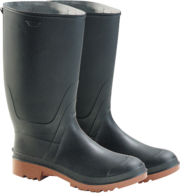
Canadian rubber boots

Canadian rubber boots, not at all fashionable, red-soled, fat legs, lined with cotton knit, been around forever.  Worn with grey socks with a white top and a red line.  And GWGs (founded 1911 in Edmonton, closed in 2004 assailed by the fashion jean market).

GWG button, ca 1930
So much is about war: rubber boots in the trenches, GWG supplying 25,000 pieces of clothing per week to the Commonwealth forces of WWII.  Fashion aside, having to supply millions of garments for the two world wars must have ramped up production unbelievably quickly.  GWG replaced men with women, doubled its work force and built a second factory. After the war GWG went back to workwear – coveralls, jeans, jackets – but also gradually tilting into the fashion market: my first pair of jeans were GWG because it was all we could get, but even then they were not as desirable as Levi’s or Lee jeans bought across the border.  The Guess Who wore GWGs, which sort of summed it up.

Rubber boots with red soles are still staples in fishing and logging,  The rest of us, if you want boots that do not weigh a ton, are now sold Hunter boots, the British wellingtons, originally green rubbers taller than our boots, with buckles at the side, now more often found in pvc fashion colour knock-offs, hot pink, plaid and such, but with the important white and red rectangular label glued to the front top.  By such nuances are ye known.  

Am I working up to some sort of thought on nativism and the new vernacular?  There are stores that cater to originals in a cult of the unfashionable but authenticKent of Inglewood is a local example: axes, straight razors and Geo F Trumper shaving soap in wooden bowls: ‘the brush, the razor, the axe’ is their tag line.  The axe.  Not sure I get it but it is all about being manly I think. 

Viberg work socks, Viberg, Victoria BC since 1931