Wednesday
May092018

the material culture of cladding

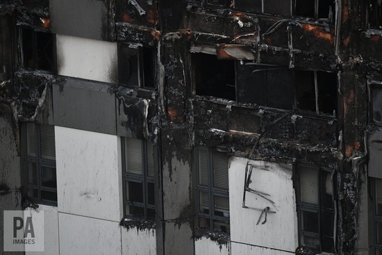
Grenfell Tower cladding damage after the fire of 14 June 2017Grenfell Tower technical facts and political speculations: designed and built in 1967 in concrete.  A marginal amount of insulation on the inside walls.  Despite the valorous critical re-evaluation of Britain’s extensive postwar brutalist movement, housing towers such as Grenfell looked old and ugly.  What was revealed in the weeks after the fire was the diverse and rich life contained between its old and ugly concrete floors and walls — not the tight old London working class communities that had gone through the Blitz and who until Windrush and the empire coming home were white and deeply rooted in London as a place.  No, Grenfell 2017 was hugely diverse: the new London which because of the numbers of 1960s council towers still has economic diversity built into its heart.

Grenfell Tower, designed in 1967 by Nigel Whitbread for Clifford Wearden Associates, built 1972-4 before the addition of insulated aluminum claddingNonetheless, Grenfell flats were cold, its architecture a failed socialist model: some new clothes were needed.  This is where a discussion of the material culture of architecture becomes relevant.  The 1967 architecture was straight-up modernism: concrete was exposed, fire was contained within concrete units which all had fresh air, long views and floor-by-floor communities of similar economic circumstance, in theory.  Come 50 years later, the model and the architecture has long been discredited.  Its facelift solution was two-fold: increase insulation and make it look glossier by covering the outside with gleaming silvery aluminium insulated panels.

Grenfell Tower renovation, 2012-16, Studio E Architects.It is these panels which are the material expression of a cultural appreciation of architectural style; not architecture, but the look of architecture.  That these panels were a cheapjack product is another consequence of ideological change where government is less responsible for the care of its citizens than in the postwar era, therefore there is less money allotted to housing, social welfare or community support.  It is concerned, however, with appearance.  Things must look successful, not crumbling, to attract investment.  Council towers all over Britain have been newly clad in insulated panels, many of which fail fire tests.

This is what material culture is: a sense of ourselves through the materiality of our choices.  It isn’t about art, or architecture, or practices deemed progressive, or even conservative in the sense of conserving what one has.  It is about both inadvertent and conscious practices that establish stature and identity, for better or worse.

Monday
Apr232018

cane riot shields, India

CRPF hold shields as Kashmiri protestors throw stones during protest in old city Srinagar. 'Top LeT militant Abu Dujana killed in Pulwana encounter', The Hindu , August 1, 2017

A clear example of a weak system used in the hardest of tasks, riot response by police. India has access to polycarbonate shields, but its police forces are often cash-strapped, thus this more historic and local version — not bullet-proof, but effective against rocks, sticks, bottles, the weapons of equally cash-strapped rioters and protesters. 

The incident above was reported as an encounter in Pulwama district of Kashmir where security forces were engaged in a counter-militancy operation during which a Pakistani LeT commander was killed.  The report in The Hindu includes this paragraph:  'The official said that over 100 “miscreants” started pelting stones at security forces involved in the anti-militancy operation in Hakripora area of Pulwama. He said the security forces used tear smoke shells, pellets and fired few live rounds to disperse the stone-pelting protestors.'

The escalation of the technology of combat: how much of disorder in the streets is actually about harm, and how much is about the theatre of protest?  When it becomes asymmetrical, where either bullets are fired at bamboo screens, or bullets are fired from behind polycarbonate and kevlar shields at unshielded fighters throwing stones, power resides with the effectiveness of weaponry against protection from such weapons.

If the bamboo screens are effective in Srinagar, clearly the police have judged quite finely the kinds of missiles coming towards them.  They'd probably like more impermeable shields, but in the case of police, rather than armies engaged in wars of invasion, they also probably do not want a bloodbath in their community.  Kevlar shields would encourage kevlar-piercing bullets, not just stones.

This is all quite far from the asymmetry of suicide bombers, cell phone triggers and chemical weapons — the combination of technology and purpose.  We are told such methods are spread by social media: instructions,  ideology and justification, thus if and where bamboo shields are still in use, the conflict is not modern, is not technological, but is as old as Kashmir itself.

There is a difference between policing and war: the police maintain order with something like the preventative strategies of an arms race, each side held in detente by their co-refusal to escalate to outright war and consequent annihilation.  The bamboo woven shield is carried with the trust that the opposition, whatever it might be, will use ammunition proportionate to the strength of the shield.  And vice versa, that the protesters expect the conflict to be at the level of stones, not guns.  When either side breaks that trust, the social contract is broken, and as we have seen with the recent escalations of civil warfare whether in the US or Syria, it is no longer about keeping order but about killing.

Saturday
Nov112017

the poppies blow

a Haig Poppy from Lady Haig's Poppy Factory, London, founded in 1926.

One can only think that the British and the British Empire side, while officially victorious in the Great War, was left grievously wounded and stunned.  It took eight years before the Poppy Fund was established, more for the cenotaphs.  War is clearly not a zero-sum game; everyone is damaged, everything is set back, everyone mourns. 

Tuesday
Jun202017

sniper camo

Turkish sniper captured during the Gallipoli Campaign of WWI

Lightweight BDU Ghillie Suit $ 269.99 at Ghillie Suit DepotAnd on it goes. 

I sense a fashion moment coming on.

Monday
Jun192017

camouflage for mummers

Nigel Goldsmith, photography www.nigelgoldsmith.co.uk. The history of the Marshfield Mummers goes back more than two hundred years. The Mummers themselves are played by men local to the area, their identity is concealed by a costume made from torn strips of newspaper and cloth.

This is a case of ‘looks like, but is not like’.  The morphology of camouflage, at root about invisibility or confusing identity, shoots off in many directions sometimes to arrive at the same solution.  The centuries-old  English tradition of mummering is a Christmas event where men don costumes to mask their identity and perform plays or dances for food and drink.  It is not unlike Hallowe’en trick or treating – the extraction of goodies from people who normally wouldn’t give you the time of day – in England it was about class: villagers targetting the big house, for whom most of them worked but about which they were unable to express any feelings.  In disguise one can say and do anything: the true subversive purpose of carnival.

In England mummering appears to be safely encapsulated in the world of folk tradition, re-enactments of old, defunct practices.  In Newfoundland, it never went away. With various degrees of lewdness, men dress up as women with pillow cases on their heads to disguise their identity and travel about in gangs extracting food and drink from householders.  

The Marshfield Mummers, in the Cotswalds, make their costumes out of newspaper and have a parade and a performance on Boxing Day.  Originally a play was performed throughout the twelve days of Christmas, but this practice died out in the 1880s.  It was resurrected in 1930, just before the last of the aged mummers took their knowledge of the play with them.  In this particular village the play was revived and disguise used newspapers; the mummers were known as The Old Time Paperboys.  Mummering pre-dates newspaper; at the beginning of the Depression in the 1930s newspaper might have been the most accessible material to make a costume out of; soon newspapers will be a rare and eccentric fabric for costume-making.


North Waltham Mummers, Hampshire, c. 1949 (Photographer: Douglas Dickins)There are several layers here: the original nineteenth-century practice, the revival practice from the 1930s, and how it has evolved, or not, to today.  When does something become folkloric, rather than folk?  This question arises with any folk revival. It was asked in the 1960s when folk songs swept through universities of middle-class soon-to-be professionals.  Bob Dylan moved on, Woody Guthrie didn’t. The rise of the kind of recent populism we are seeing is based on iconic folk traditions: the coal miner, the family farm, the factory worker as un-evolved specimens of a better time.  In the 1960s folk music looked to the Depression, to depressed Appalachia, to earlier struggles, so hopeless that all one could do is to sing to lighten a heavy load.  None of these iconic moments appear to be prosperous: that doesn’t make folk memory, rather it is hardship that is valourised in the revivals.

Mummering was performed by men with almost no means using high holidays such as Christmas to get a bit extra.  That it was entertaining at the same time was a kind of insurance that relations between those who have and those without will not tip over into revolution.  Folk songs were full of coded messages under the cover of entertainment. If the messages weren’t for you (underground railway instructions for example) you didn’t see them.  There is subversion, always, in folk practice, something that folk revivals cannot capture.

Sunday
Jun182017

the ghili suit of the Iranian Army

Camouflaged Iranian Army soldiers march during a parade in Tehran. Photograph: Abedin Taherkenareh/EPA

This remarkable image from the Army Day Parade in Teheran on April 18th, and many more like it spread around the web, shows a particular kind of Iranian Army camouflage called a ghili suit.  It appears to come in a range of colours, from white to charcoal, and clearly acts much like the dazzle camouflage on WWI ships where the shape of the body (of the ship, or the soldier) is rendered diffuse, directionless, completely indistinct. This seems quite different from the flat camouflage patterns of western armies which rely on colour and a general blurriness within the clear outline of the body.  

Checking on the history of the ghili suit, it is well known in hunting circles, originally made of burlap and used by ghillies to catch poachers. British snipers wore them in WWI. The Iranian Army wear their suits with gaiters, as do Highland marching pipe bands, another curious reference to some sort of Edwardian Hibernia.

Further checking reveals a great number of war games sites with instructions on how to make your own ghillie (the northern European term; ghili, the Persian spellilng) suit, such as this one:


From GhillieTreff.de, clearly a ghillie enthusiast whose aim is total invisibilityEasy to mock, as do many of the sites that show the Iranian ghili suits on parade, but it is war, in Iran, not a war game.  This is extreme garb, so environmentally sensitive to shadow and light, shrubs and glare – a sensitivity upon which one’s life depends.  This isn’t a uniform proclaiming identity, rather its absence. 

Friday
Apr142017

material permanence for an impermanent architecture

Rau. Triodos Bank, Driebergen-Zeist, 2011-Thomas Rau was recently speaking at Ryerson; the notification was illustrated with his 2011 Triodos III project, a values-based bank in Driebergen-Zeist, which encapsulates his thesis that Nature is a bank and if we treated it as such we wouldn't exploit it as we do. By extension, every building should be considered as a bank of materials, valuable because finite, like currency, which circulates over and over again through time and society.  Triodos III is an example of such an architecture.  A logical extension of the idea of a building as a bank of materials would be an architecture that is demountable, with individual pieces salvageable as whole units rather than the pulverising demolitions that usually happen when a building reaches the end of its usefulness (not necessarily its life, but the limits of appreciation of its value).  In this it is assumed that buildings have a life span.  

from: Shaun Fynn. Chandigarh Revealed: Le Corbusier's City Today. Princeton Architectural Press, 2017Was this a consideration when Le Corbusier was building Chandigarh, seen in a new book, Chandigarh Revealed: Le Corbusier's City Today, by Shaun Fynn?  His was a hugely complex architecture built with a single material, concrete, that once cast cannot revert back to its original ingredients – the chemical reaction when water meets quicklime cannot be undone.  Correctly built, this kind of architecture was forecast to have an infinitely long lifespan; deconstruction and reuse of the materials was not considered.  

Unlike concrete buildings regularly demolished in the western world, despite the new-found mid-century love of béton brut — so much of it already gone, Le Corbusier's Chandigarh project persists: there has been little development pressure to constantly rebuild in what was the de-colonising, developing, third world.  Modernism was the architecture of liberation: it promised a new start, in all senses, and for this it retains a political and historic power that we don't recognise here.  New Generation Thinker Preti Taneja, Leverhulme Early Career Research Fellow at Warwick University, read an essay recently in the New Generation Thinkers series, about 'The first generation of post-Independence architects [who] built on this [modernist] legacy, drawing also from Le Corbusier, who designed India's first post-partition planned city, Chandigarh, with its famous 'open hand' sculpture; and from Frank Lloyd Wright and Walter Gropius, to create some of the most iconic public buildings across India today.' 

There is something about the utopian socialist roots of modern architecture that meant something in the developing world but which passed the developed world by. Here, it is seen as a style, not as something for social good. Indeed, by the 1970s, projects just twenty years old, such as Yamasaki's Pruitt-Igoe in St. Louis, were totally discredited as the social ambitions of the architecture did not match at all the political fears of race and poverty.  

Rau: TurnToo, a declaration of material rightsRau's architecture as material bank refers to a pre-industrial model of building, where buildings were assembled and dis-assembled by hand.  He extends it to industrial processes, with the circularity potential of each material as the pre-condition for its use.  It has the potential to redevelop modernism without the extravagance of material exploitation that came so easily to us in the west, where the environment was assumed to be infinitely patient with us, self-healing the wounds we inflicted by fire, by mining, by impermeable cities, by voracious appetites.  His architecture of circularity assumes an impermanence to buildings whereby they can be constantly in flux, parts replaced, parts repurposed.  This is such the polar opposite to the still, eternal, immoveable architecture of Chandigarh.

from: Shaun Fynn. Chandigarh Revealed: Le Corbusier's City Today. Princeton Architectural Press, 2017

Monday
Apr032017

21039 Pacific Coast Highway life

David Hockney sitting in the living room of his Malibu house, March 1988 Photo: © Condé Nast Archive / Corbis Artwork: © 2015 David Hockney

The streetview of Hockney's beach house studio (below) is quite bleak, and yet inside 21039 Pacific Coast Highway when Hockney worked in it exploded with light and colour.  Above is a photo of Hockney in the beach house: the jungle of plants through the window, the bright furniture, the brilliantly white walls.  I should think that growing up in Bradford during the war and the bomb-damaged 1950s and then being teleported to sunny California of turquoise and hot pink would hit all the rods and cones of the eye like a thunderbolt.  So gay, in the old sense of the word, so carefree.  So sun-filled.  So primary.  

Below is his 1980 painting, Mulholland Drive: the Road to the Studio.  Compared to the actual road to the studio there is something spiritual about the colour.  This is more than just using acrylics straight from the tube, it is an affirmation of an intensely vivid new life.

David Hockney. Mulholland Drive: The Road to the Studio, 1980 acrylic on canvas,  86x243 in.

Wednesday
Mar292017

travelling landscapes

from Google Maps: 21039 Pacific Coast Highway, Malibu, California

It seems a bit intrusive to peer at the house that Hockney once owned and sold in 1999.  I doubt it had a pool as it was right on the beach beside the Pacific Coast Highway in Malibu.  Now is that a romantic address or what?  This google street view shows the row of fairly humble beach houses on one side of the road, and a rough hill on the other.  Looking up the native vegetation of such a hill, coastal sage scrub, typical of cismontane southern California and northern Mexico, consists of aromatic low-growing shrubs: California sagebrush (Artemisia californica), California buckwheat (Eriogonum fasciculatum), coast brittlebush (Encelia californica), black sage (Salvia mellifera), white sage (Salvia apiana), Lemonade berry (Rhus integrifolia) and Prickly Pear Cactus (Opuntia littoralis). 

I only looked this up as I had been reading about the Corsican macchia, so aromatic that it is the unique scent of Corsica.  The macchia, or in other spellings the maquis, contains crocus (crocus corsicus, Corsican saffron), orchids (Conrad's orchid, serapias nurrica), colchicum, violet, romulea, aconite, garlic, aquilegia, daisy, cyclamen, carnation, digitalis, everlasting, hypericum, forget-me-not, mint, nepeta, ranunculus.  There is heather, narcissi, violets, passionflower, marguerites and mimosa. There is bougainvillea and oleander,  lilac thyme, white and pink broom. Lavender grows wild as does myrtle, rosemary, marjoram and mint.   

Corsica is an ancient and underdeveloped island, Malibu is a highway just north of the freeways of Los Angeles.  This might have something to do with the sparseness of plant life in the coastal sage scrub compared to macchia.  I read somewhere in all of this that one of the problems with coastal sage scrub is the word 'scrub' which gives it little value in the popular imagination. 

My project here, given that the Gulf Islands are said to have a mediterranean climate (ha! not after this winter) and that I am very close to the islands (albeit under a mountain, which might be a problem, part of that rocky spine that is Vancouver Island), is to develop a macchia myself, to turn one's garden into a wild, aromatic ground cover.  Almost every shrub in the Corsican macchia I have seen as singles somewhere in the yard, so they do grow here.  And there are olive trees up island.  And I will add eucalyptus, for that beautiful perfume that so characterises the northern California coastline.  And California poppies, which grow wild by the road.  I see the irony in all of this, but I'm also optimistic.

I think I would quite like to live in Corsica/California/Canada, with olive trees.  It is a bit of a dream, still.

Monday
Mar272017

David Hockney. A Bigger Splash, 1967

David Hockney. A Bigger Splash Acrylic paint on canvas, 2425 x 2439 x 30 mm. Tate T03254

This very well-known painting epitomises all the burnt landscape/blue tiled pools of California that are so romantic to those of us from different landscapes.  The image is of one of those minimalist modern tract houses of Los Angeles.  The Kaufmann House was a beautiful example, but in the 1950s and 60s all little suburban LA houses had a pool. 

Hockney painted this one with a roller and Liquitex — a discussion about painterliness, image and surface that was intense at the time.  The traditional surfaces of art were vehicles for the depth of field and the rendering of image.  The painter's skill was measured in its passion and its verity.  Postwar abstraction focussed on the surface itself, not the image.   In The Bigger Splash, the painted part floats in a larger square of unpainted, unprimed canvas: it clearly is acrylic paint flatly applied to material stapled to the wall, a rejection of the centuries of priming and underpainting, working and reworking in oil paint to the edges of the stretchered linen ground.  The part that is painterly, the splash, was done with brushes, but the splash itself was something Hockney found in a book of photos of swimming pools.  It wasn't about direct observation from the side of the pool, but rather direct painting from a photograph, another transgression of expected fidelity to a visual experience.  This was a figurative work assembled like a collage of banal images and as deep as banality can be.  

It is in such a thin, un-reflexive, uninteresting world that one can remake oneself — is this not the dream of the new world, without class, history, social conventions and repressive social narratives?  Of course 1960s southern California was not without its class by wealth, division by race and services by ethnicity, but if you had come from grey, cramped, mingey, prissy England of postwar rationing and criminalisation of homosexual acts, Los Angeles must have been a nirvana for a young white artist with an excellent education and something to say.  

If you take every artwork you see as a thesis, rather than as an image, much is revealed.  Everything means something.  Painting in Liquitex with a roller isn't a casual act, it is right at the centre of the nexus of abstraction and conceptualism.  Copying a photograph continues Andy Warhol and Richard Hamilton's late-1950s appropriation of images in the public domain.  And yet, and yet, it is the image of a bigger splash, used as the title for a Hockney documentary, many reconstructions of the pool and the house online, reworking of the image itself as homage, as graphic design, as really dreadful reassemblies.  Just look at Hockney+splash on Google images.

Secretly I think we all still would quite like to live in southern California, in a little modern flat-roofed house with a pool.  It is a bit of a dream, still. 

Wednesday
Mar222017

David Hockney. Pearblossom Highway, 11 - 18th April 1986

David Hockney. Pearblossom Highway, 11th-18th April 1986, photographic collage, 77x112 1/2 in. © 1986 David Hockney

Another desert landscape made familiar by cowboy movies and Paris, Texas; this though, the Pearblossom Highway in California, north of the San Gabriel Mountains which you can see on the horizon, otherwise known as State Route 138. 

The Getty quotes Hockney on this piece:   'Pearblossom Highway' shows a crossroads in a very wide open space, which you only get a sense of in the western United States. . . . [The] picture was not just about a crossroads, but about us driving around. I'd had three days of driving and being the passenger.  The driver and the passenger see the road in different ways. When you drive you read all the road signs, but when you're the passenger, you don't, you can decide to look where you want.  And the picture dealt with that: on the right-hand side of the road it's as if you're the driver, reading traffic signs to tell you what to do and so on, and on the left-hand side it's as if you're a passenger going along the road more slowly, looking all around. So the picture is about driving without the car being in it.

Well, that makes sense if you are in a right-hand drive car, as one is in England, but not in California.  Is driving one of those automatic things that has cut channels in the brain that insist that although sitting on the left hand driver seat, one is spatially seeing the world from the passenger seat because that is how you learned to see in a car in England?

For a North American, this photocollage tells me the passenger is worried about where he is, and the driver is the one noticing the details, as one does, at the side of the road.  On long haul drives, peripheral vision is very alert. This allows you to read a book on the steering wheel while driving the I-25 through Wyoming, one large beige halfpipe.  Well, when I was younger.

The mid-1980s was the heyday of the photo-collage for architects: how to show a site, not with the single Renaissance eye focussed on the far horizon, but more the sense of a place full of details that a single 35mm shot simply cannot include.  I remember taping together 180° site pans in the 1970s and, photoshop aside, we were still being sent photo collages in the mid-2000s: e.g. Rufina Wu's underground Beijing rooms in On Site review 22:WAR, 2008.

Hockney is a painter, not an architect documenting a site, but both used the documentary truth of the raw photograph, without the limitations of the camera, to make a different reality based on perception rather than fact. 

This is a pre-digital conversation.  

Hockney's Pearblossom Highway does record the throbbing relentless desert sky with headachey accuracy.

Thursday
Mar162017

Richard Long: Avon River Mud, 2011

Richard Long. A Line Made By Walking, 1967

Maybe all art is slow art, which is why it is art and not graphic design.  1967, Richard Long, then a student: A Line Made By Walking — the smallest gesture in a drawing where there is only artist and surface; no paintbrushes, paint, equipment, frame.  The surface is complex — grass and other little plants easily crushed, changing the nap of the field where Long walked back and forth until his path registered.  Cognisant of Smithson and the American land artists of the 1960s, he, perhaps because British, a student and probably cash-strapped, made equivalent gestures in the landscape without all the heavy lifting of cranes, excavators and dump trucks.  The restriction becomes the modus operandi for the rest of his career. 

Here, a video: Making River Avon Mud Circle, M-Shed, Bristol 2011

Richard Long. Video: Making Avon River Mud Circle, 2011

Wednesday
Mar152017

Paul Peter Piech: political posters from 1968-1996

Paul Peter Piech, Racism Is a Poison, Remember Soweto. Linocut from the Regional Print Centre/Coleg Cambria Collection

If we are meant to be remembering Soweto, we are somewhere in the late 1970s, nearing the end of the handmade political poster: one could also be remembering Vietnam, remembering Nixon, remembering so many things that brought people out onto the streets in their hundreds of thousands: vigils in front of the South African Embassy in Trafalgar Square that continued for decades, Greenham Common, a massive 1980s women's encampment protesting the placing of Cruise missiles in the UK by the USA.  Far from being some sort of golden, simpler era where men were men and women were cross and the Cold War was frozen in an impasse, the 1960-80s era, ending with the fall of the Berlin Wall, the breakup of the Soviet Union and the impending release of Mandela, was hot and full of social movement and where those who are considered the elites now, the educated, the left-leaning, the experts and the professionals, had a serious voice.

But that's a long time ago now; one looks at the political posters of Paul Peter Piech to measure just how emasculated the alleged elites are now.  This is why we look at the past, not through rose-tinted John Lennon glasses, but to measure where we are today and how we got here.  One thing we no longer have is the political poster: we have political tweets — 140 characters with all the economy of the linocut and two colours of ink. Both can be devastatingly direct and inciting. The poster is not a long form essay; rather it puts out visual memes coded with references: above, identity and stigmata, violence and gun barrels held by hands, pointed at other hands, letters laboriously carved out of linoleum by hand, run off a press by hand, hands bleeding. The hand as synecdoche for a long form message.  

Piech was an American posted to England during the war, married there and stayed.  Some of his work was recently shown at the Peoples History Museum in Manchester.  The exhibition was called Dedicated to all Defenders of Human Freedoms: The Art of Paul Peter Piech.  I feel as if I am in a time warp: evidently this sort of thing still goes on, this valorisation of the alternative voice, not here, but at least somewhere, such as Manchester. 

Piech's work is, by the by, quite beautiful.  He was working up to his death in 1996.  The 1995 poster below, The History of Jazz, still uses his laboriously-carved hand lettering.  The sheer amount of time it takes to cut a letter, to fit the word to the space, to make a capital C hold a smaller letter – the process itself allows time to think.  At the same time, to do a portrait as face and hands, the way that Sargent did a century before, cuts to the chase. The processes might be slow, but the message is quick and focussed. If there was ever a time that we needed fewer words dashed off hot-headedly on a phone by people who don't write particularly well, it is now.  In the incoherent and very confusing cloud of words that surround us, perhaps the processes by which alternative voices will emerge will be like the political poster of the 1970s: deliberate and slow.

Paul Peter Piech The history of jazz. Linocut 1995. From the Regional Print Centre/Coleg Cambria Collection

Saturday
Mar112017

Annie Oakley

A wistful Buffalo Bill Cody, circa 1890, a couple of years after he had gone to England to visit Queen Victoria.

This has been a week or so, here, of the physical and cultural landscapes of the American southwest, long before malls and freeways, snowbirds, wetbacks and ICE.  The West was a powerful image, for those of us in the west who didn't entirely see it as those in the East might have – fenceless, lawless, full of saguaro cactus and mesas.  Rather those of us in the west north saw it as something our grandparents and parents did.  They knew the flowers, the grasses, the winters, the colourful characters.  Allegedly my great-grandmother had an affair with Robert Service; one grandfather, an executive with Imperial Tobacco in Edmonton, had joined a travelling circus at 13, the other grandfather lived briefly near Olds in a chicken coop, with his school tie, violin and dancing pumps as an apprentice gentleman farmer: these were real, not myth.  

At the same time we were awash with the mythology of the American West as it came through popular culture and that increased to a tsunami after WWII.  For example, there was a tv program for kids about Annie Oakley who had worked for Buffalo Bill, Civil War veteran, Indian hunter, showman, huckster.  In Grade One I got  an Annie Oakley lunch kit.  My brother three years later got a Roy Rogers lunch kit which he promptly lost, for which I don't blame him, it had Dale Evans on it, who was such a drip. 

Annie Oakley, sharpshooter, a little proto-feminist.  In the tv program her sidekick was Tagg, a kid, a boy; her horse was beautiful.  We all drew horses as little girls, before we moved onto ballerinas, leaving the wild west behind.  However, Annie Oakley was a far more exotic model for very little girls than, say, Anne of Green Gables, a book which I could not read at all.  For Annie Oakley there were no rules; for Anne Shirley it was all about fighting the rules that cramped her style.  It made no sense to me.

The west is different from the east; it is another country.

Aladdin Industries Annie Oakley lunch kit, 1955. This one was on Ebay and sold for $350. The cream edges were pressed like leather, and the sides had a belt of bullets running around them.

Friday
Mar102017

e e cummings, 1920: Buffalo Bill's defunct 

Buffalo Bill's
defunct
        who used to
        ride a watersmooth-silver
                                  stallion
and break onetwothreefourfive pigeonsjustlikethat
                                                  Jesus

he was a handsome man
                      and what i want to know is
how do you like your blueeyed boy
Mister Death


This must be on a whack of English 101 reading lists as there are dozens of webpages analysing it.  The most beautiful, the most dense with reference, every word so threaded through by poetry, art, the politics of capitalist America, is this by Louis J Budd, written in 1953:

The poem's attitude is epitomized in the word "defunct." Buffalo Bill has not undergone a tragic crisis, he has not passed through a spiritual ordeal; he simply has ceased operating, liquidated like a bank or a poorly-placed filling station. The reader primarily realizes that William F. Cody will no longer prance through metropolitan hippodromes as the chief asset of a gaudy commercial venture. More broadly, the reader should recognize that the westering dream and nostalgic enjoyment of that dream are ended, the dream ripped by realities or stultified by vulgar misuse and the nostalgia deflated by post-Versailles cynicism. Buffalo Bill and his cohorts, galloping through this world in a blinding shroud of physical exertions divorced from meaningful reality, never were alive to tulips or the small white hands of the rain and can be scarcely said to have died.
— from Louis J. Budd, "Cummings' BUFFALO BILL'S DEFUNCT." Explicator 11 (June 1953): Item 55.

I would like to have written this.

Tuesday
Mar072017

oh give me land

click on the image to go to Bing Crosby & The Andrews Sisters. Don´t Fence Me In (Decca 23364, 1944) Of all the versions, including the near-manic David Byrne version of 1999, Bing Crosby's is the one with a horse's walking gait, much like all the old cowboy songs. The Roy Rogers version is very tumpty-tump: he was no singer.

from Wikipedia: 'Originally written in 1934 for Adios, Argentina, an unproduced 20th Century Fox musical, 'Don't Fence Me In' was based on text by a poet and engineer with the Department of Highways in Helena, Montana, Robert Fletcher.' Cole Porter bought the poem, reworked it and set it to music.

Roy Rogers sang it in 1945 in a film of the same name which I must have seen many times throughout my childhood as Gene Autry, Roy Rogers and David Niven movies interspersed with the Marx Brothers, the Three Stooges and Loony Toons reran on an endless loop after school on channel 11 from Bellingham.  As my parents had grown up in Calgary during the 1930s and early 40s and had romantic (to me) stories of trail rides and/or setting off on their bikes to ride way out into the foothills, this song was about a lost elysium, something that mooning about on the beach on Vancouver Island just didn't match up to.

One might say that I moved to Calgary because of the spirit and the landscapes of this song:

Oh, give me land, lots of land under starry skies above
Don't fence me in
Let me ride through the wide open country that I love
Don't fence me in
Let me be by myself in the evenin' breeze
And listen to the murmur of the cottonwood trees
Send me off forever but I ask you please
Don't fence me in

Just turn me loose, let me straddle my old saddle
Underneath the western skies
On my Cayuse, let me wander over yonder
Till I see the mountains rise

I want to ride to the ridge where the west commences
And gaze at the moon till I lose my senses
And I can't look at hovels and I can't stand fences
Don't fence me in

Monday
Mar062017

George Herriman: ways of seeing, ways of being

George Herriman, 1937, for King Features Syndicate.

George Herriman (b.1880 in New Orleans) published his little abstract landscapes every day from 1913 to 1944 when he died.  Under the eye of Offisa Pup, Krazy Kat's unrequited love affair with Ignatz played out in a sunbaked, empty Arizona desert: roads are two lines, mesas are geometric blocks sitting on a tabletop horizon.  Somewhere is a little scribble of action and a running text. 

This was in the childhood of so many American artists of Diebenkorn's generation: Twombly, Rauschenberg, Thiebaud, Dine.  I've written about Thiebaud's city drawings before, but I can also see the flattened space of Herriman in Diebenkorn, especially in the sketchbook drawings such as the one below.  These are ways of seeing, not in the Berger sense that the subjects of art are the objects of society, but rather a way of seeing small human dramas played out on the immense American canvas that was the early twentieth-century West.  Too, there is something about growing up without the eastern seaboard weight of European art history, that Henry James view of America, rather than the light-footedness of e e cummings

Wednesday
Mar012017

Richard Diebenkorn: Notebooks, 1943-93

Richard Diebenkorn, “Untitled” from Sketchbook #2, pages 33-4 (1943–93), gouache, watercolor, crayon with graphite and cut and pasted paper on paper (gift of Phyllis Diebenkorn, © The Richard Diebenkorn Foundation)

Alison Meier describes Diebenkorn's 29 sketchbooks as 'a sort of nomadic studio', an apt concept: the emergency kit for ideas, the travelling bank of lifesaving notes.  They must have been everywhere as they are all listed as 1943-93, always in play, just grab a notebook handy and add a page or two.  Nothing here indicates the notebook as chronological recording of one's development; there appears to be little reflection on one's art as continuum, nicely dated.  No, these are simply files, unfiled, but like going through a box of unsorted slides: with each one the time, the heat, the place, all come rushing back.  

It also says something, this disinterest in chronology, that all the work, the thoughts, the ideas, are on an equal footing.  Early drawings, done with uncertain youth, are still around simply because they are in the notebook with the green cover, or the black spiral, or the one with the red paint on the outside; vaguely interesting, occupying a slim bit of notebook real estate next door to a vivid crayon thing done forty years later.  Plus they might have an idea in them.  

Painting is not like writing.  The physical act of placing one word after another, and another, page after page itself is linear, sequential.  Even the white space of concrete poetry contributes to the order of the poem, even erasures, crossings out and the reworking of writing disappear in print, usually its ultimate destination.  Painting itself is a constant reworking of surface, three-dimensional, un-linear, a storm of marks that are never actually finished, rather they are abandoned.  Famously De Kooning continually reworked his canvases, they were never finished, they are dated by duration.  This quote, source unknown but found here, 'I paint this way because I can keep putting more things in it - drama, anger, pain, love, a figure, a horse, my ideas about space.'  Have to trust what might be a dubious source, however, it says something about using the canvas as a notebook that keeps getting added to.  Willem's notes on women.

Diebenkorn's notes on land. places. people.  They have been given to Stanford by Phyllis Diebenkorn, a rather wonderful bequest that one can see here in an interactive display.  museum.stanford.edu/diebenkornsketchbooks/

Richard Diebenkorn, “Untitled” from Sketchbook #16, (1943–93) (gift of Phyllis Diebenkorn, © The Richard Diebenkorn Foundation)

Saturday
Feb252017

the exercise of wealth

The Critic, photograph by Weegee, 1943. Weegee (Arthur Fellig)/International Center of Photography/Hulton Archive/Getty Images

1943, above: Mrs George Washington Kavanaugh and Elizabeth Lehr Decies arriving at the last Vanderbilt Ball at 640 Fifth Avenue in New York just before it was demolished.  1,800 guests attended, in full fig clearly.  A set up: Weegee, the photographer, positioned the dishevelled person on the sidewalk where guests were arriving.  Not a particularly subtle piece of social criticism.

George Washington Kavanaugh was the son of Luke Kavanaugh, a knitting machine manufacturer and the inventor of a knitting burr. Mrs CGW was sent into posterity by Weegee; he snapped her several times on this particular night. This was a mink-coated bejewelled waistless woman in her 70s with a limitless American textile and manufacturing fortune. Her expression never changes, no matter who the photographer: face forward, sweet smile, full makeup, hair, tiara, she's like an American Queen Mum.

Do I care about any of this?  Am I in thrall to wealth?  Hardly, but I am interested in the ability of some photographers to be subversive, others to be sycophants: each is creating a narrative no matter how documentary they feel they are being.

Robert Doisneau wasn't taking a cheap shot when he photographed the matrons of Palm Springs below; he didn't set them up, at least any more than they were doing themselves.  Slim Aarons genuinely felt he was part of the rich and famous, and serious about it.  He wouldn't have seen any reason to set them up.  These positions are difficult for us to take seriously in this overly ironized post-irony age— Doisneau's humanism, Aarons's affection, even Weegee's blunt social commentary.  And then there is Marina Garnier's curious social eye below, photographing wealthy women in New York at le Cirque for lunch: specimens to be pinned down like beautiful beetles. 

Marina Garnier, photographer. Eva Gabor and Ivana Trump leaving le Cirque, 1990Had I not been taken by the moonlit image of a small house in Palm Springs with a T-bird in front of it, I would not have arrived here.  But it has led me to think about how one can try to understand worlds we are not part of and how to use art to comment, resist and oppose: not to bludgeon, but to put into context.  The rich are not like us; they are always with us.

Wednesday
Feb222017

Palm Springs 1960: desert oasis

Slim Aarons, photographer: Poolside Gossip, 1970

Palm Springs, la vie en blanche, playground in the desert for Hollywood; every little modern house with its swimming pool and palm tree oasis.  Richard Neutra's Kaufman House was early, 1947. This picture, above, is by Slim Aarons who was both celebrity and celebrity  photographer.  These are the beautiful people of 1970 where architecture is an important signifier but also a non-competitive backdrop.  The contemporary architectural photos of the Kaufman House are unpeopled, still, pure:

Richard Neutra, Kaufman Desert House, Palm Springs, 1947. Julius Shulman, photographer

In 1960 Robert Doisneau, well known for his Paris street photography in black and white, was commissioned by Fortune Magazine to do Palm Springs; 23 reputedly banal images were published, and then in 2010 Flammarion published the whole archive in a book, Robert Doisneau: Palm Springs 1960
It includes images such as this one:

Robert Doisneau, photographer: Palm Springs, 1960the other people of Palm Springs, not celebrities from film but in wealth.  Clearly the town acted as a resort and a protected, beautiful club.  Today one can get maps of the famous houses and drive by them: not famous for their architecture but because Barry Manilow lived here (Kaufman House) or Frank Sinatra lived there (Twin Palms, now owned by Jimmy Pattison), which must be perfectly wretched for the people now living in these precise horizontal machines for easy living.  Or not. As in the beginning they are guarded/shuttered/defensive on the street side. It is an interesting split between defence at the front and openness at the back that failed to make it to mainstream houses of that era with their picture windows, open carports, declamatory front doors.  These things don't appear in Palm Springs architecture which is part of the enduring subtlety of this kind of modernism.  It is complex, socially-informed, ultimately protective of the lives within it.